Executive-Level Clarity. Empowering growth.

Andrea Moitinho
Creative Director and Brand Strategist with over 25 years of experience helping teams unlock and scale their creative capabilities. Andrea elevates output, builds robust brand systems, and develops long-term campaigns designed for relevance and sustainable growth, all while delivering projects with operational excellence.
Andrea’s global career spans APAC (including 20 years in Sydney), and Europe. She has shaped strategy, communications, and creative direction for more than 300 startups and established enterprises, including PwC, News Corp, Scenic Tours, and the University of Sydney.
Recognized for distilling complexity into clarity, she creates enduring brand value through visual languages that are intelligent, intentional, and built to last.
Her expertise spans brand diagnostics, strategy, identity systems, communications, UX/UI design, high-level marketing collateral, templated systems, and data visualization. She provides strategic, design-led guidance that empowers internal teams while safeguarding creative integrity and long-term vision.
While highly adaptable to existing brand guidelines, Andrea’s design philosophy is rooted in Swiss and Bauhaus principles, clarity, minimalism, and bold visual expression. Her work is both functional and striking, grounded in purpose, systems thinking, and disciplined creative restraint. Every strategy and channel is approached with thoughtful simplicity and meticulous attention to detail, hallmarks of her aesthetic and strategic rigor.
Immersed in diverse cultural and business environments, she brings a uniquely informed perspective. This breadth of experience enables her to craft brands that are strategically grounded and culturally attuned across markets.
At the core of Andrea’s practice is the belief that branding, marketing, and communications extend far beyond visual identity, they form the strategic foundation for how businesses communicate, differentiate, and grow. She views creativity as the catalyst for meaningful innovation and sustained commercial success.
.svg)


.svg)
%201.svg)
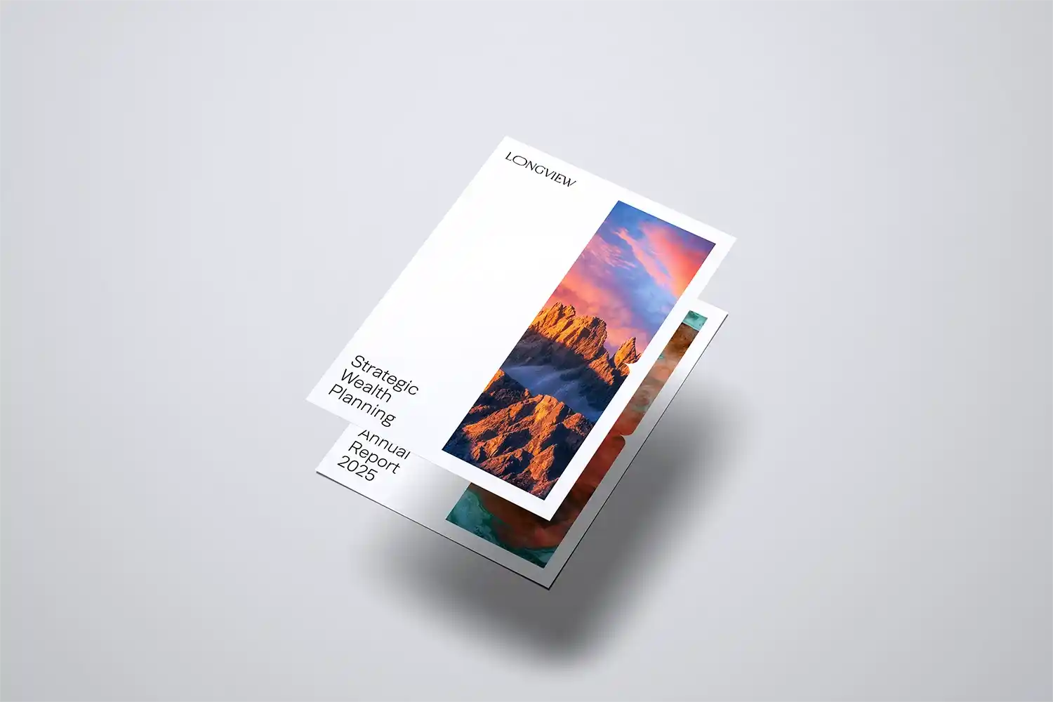
Longview Partners
Melbourne, Australia
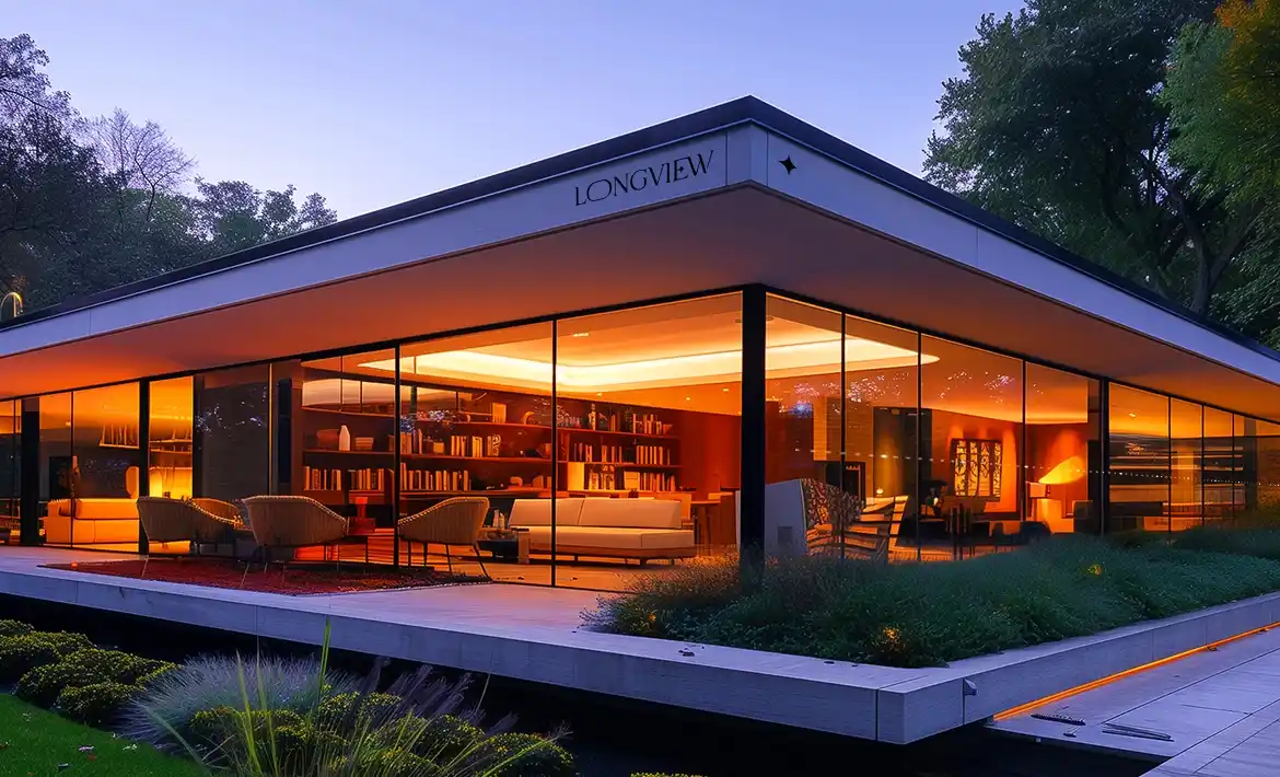
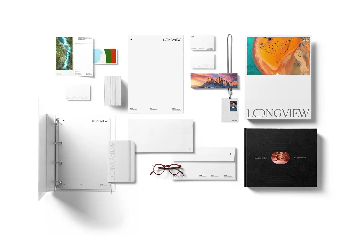
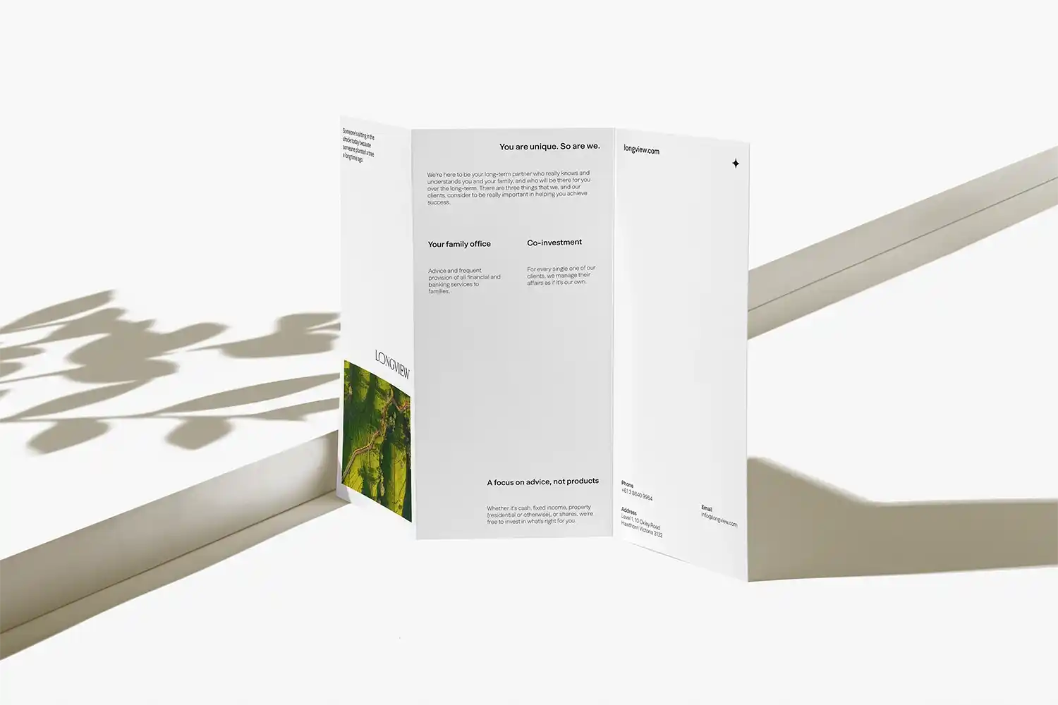
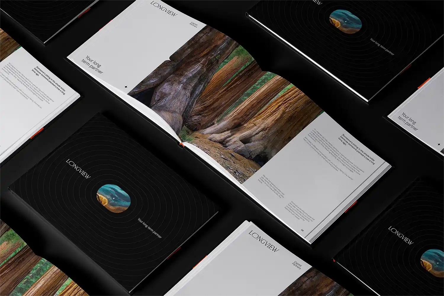
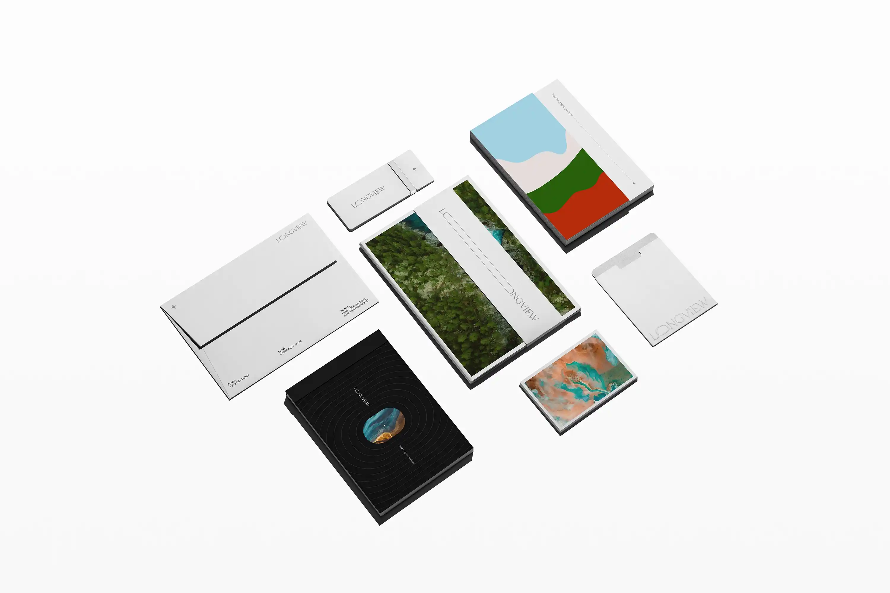
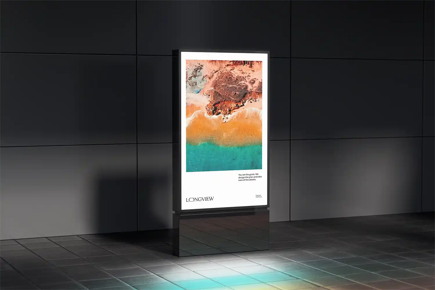
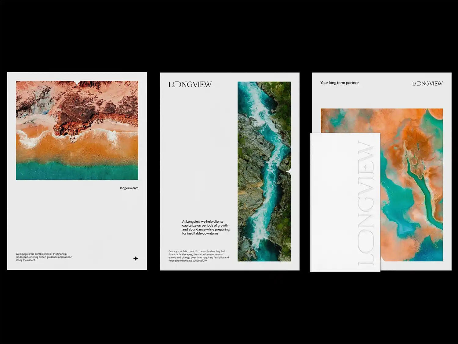
Longview Capital Partners is a wealth management firm based in Australia, committed to long-term financial strategies built on trust, integrity, and personalized client relationships.
Their client-first approach centers on offering adaptable, strategic guidance that evolves with individual life goals, ensuring enduring financial wellbeing across generations. Creating a visual identity for Longview required expressing these values without resorting to corporate clichés. The challenge was to craft a brand that feels both professional and approachable, capturing the firm's balance of grounded financial expertise and forward-thinking vision.
As a solution, the brand identity for Longview was carefully crafted to convey both sophistication and a deep sense of personal accessibility. The challenge lay in creating a visual system that felt elevated yet human, capable of resonating with individuals navigating complex financial decisions.
Inspired by the textures and tones of the Australian landscape, Andrea’s final design solution employs organic shapes, earthy color palettes, and minimalist layouts to express qualities of natural longevity, stability, and clarity. This visual language evokes a sense of peace and purpose, perfectly aligning with Longview’s core philosophy of thoughtful, long-term planning.
The resulting identity is original, refined, modern, and unmistakably Australian, instilling confidence and calm in clients through its grounded aesthetic. A carefully integrated boldness introduces quiet strength and conviction, subtly challenging the conventions of traditional financial branding while maintaining trust and professionalism. This element of contrast adds strategic tension, balancing serenity with assertiveness.
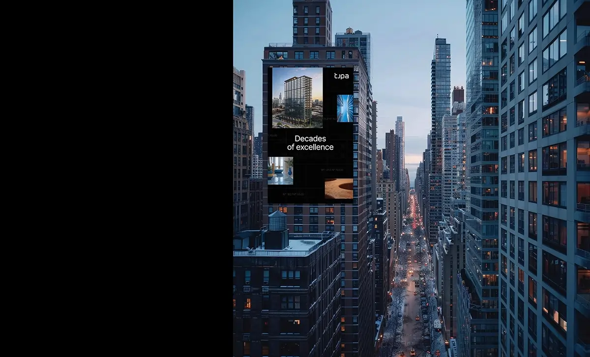
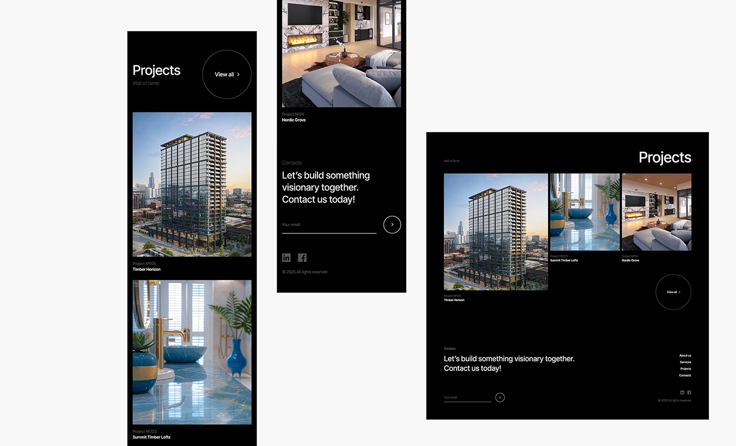
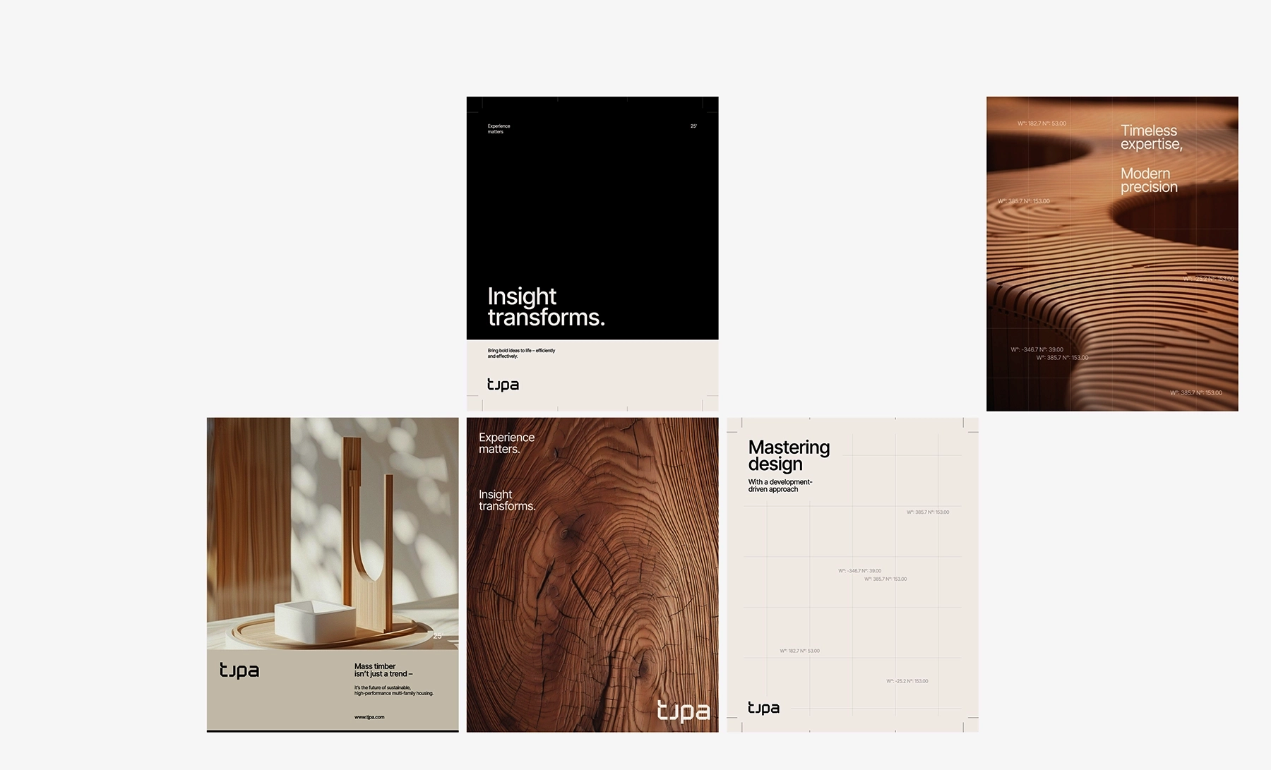
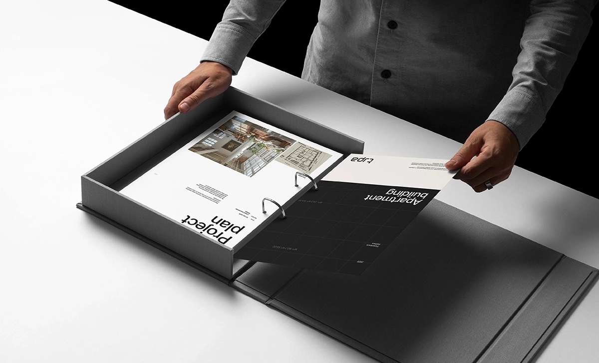
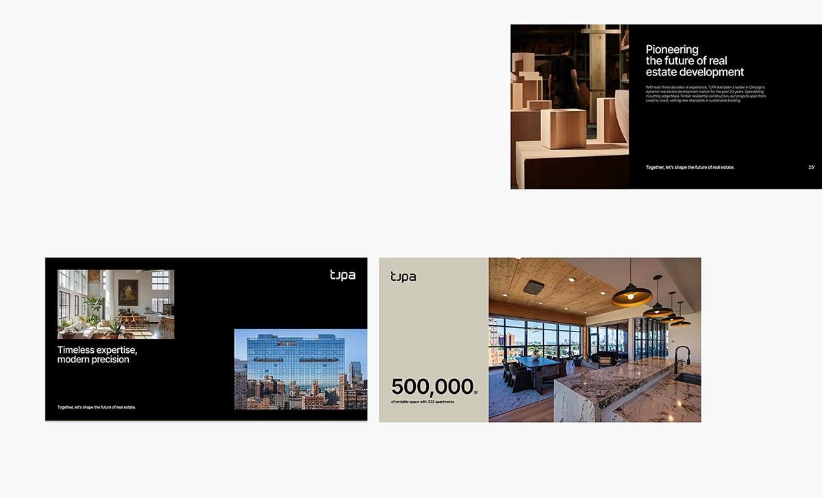
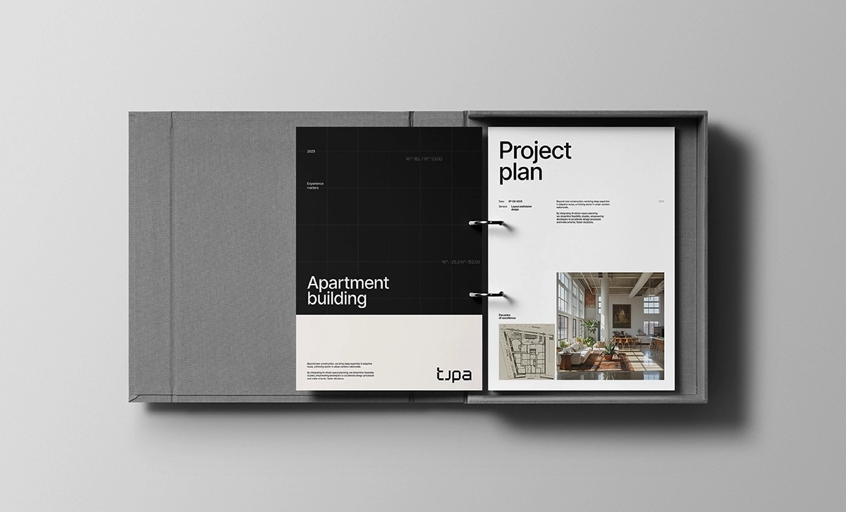
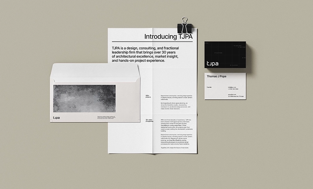
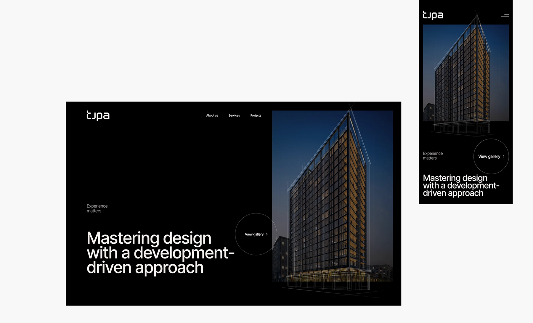
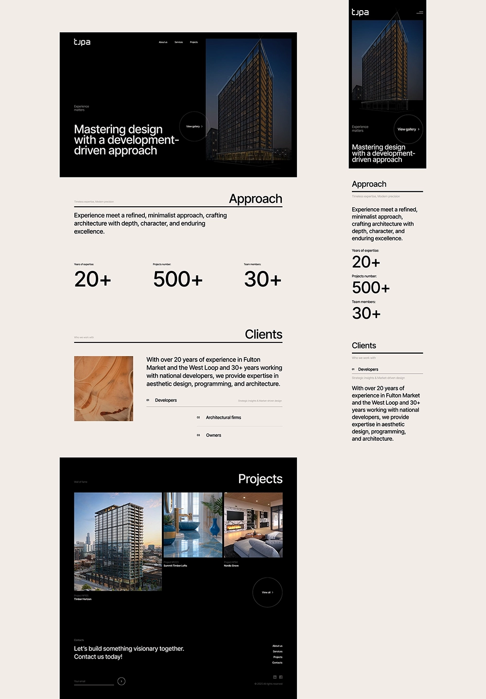
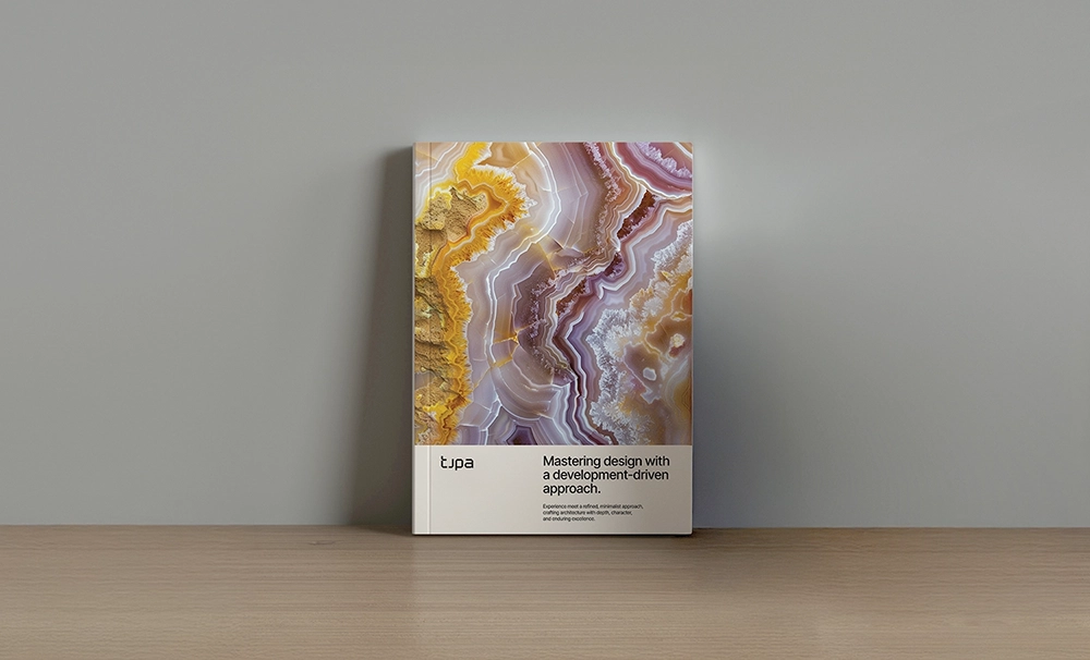
TJPA
Chicago, USA
TJPA is a Chicago-based consulting firm specializing in architectural visioning, conceptual design, developer liaison services, and fractional leadership. With over 30 years of industry experience, the team has led multidisciplinary projects across the United States, delivering innovative design solutions with a particular focus on mass timber construction, adaptive reuse, large-scale multifamily housing, hospitality, commercial developments, and student living
This extensive expertise has shaped a practice that blends creative vision with strategic precision.
The challenge was to develop a brand identity that communicates TJPA’s core strengths, design excellence, strategic leadership, and innovation, while remaining approachable to both seasoned industry professionals and those less familiar with architectural services.
The messaging needed to be clear, compelling, and adaptable across various contexts without compromising the firm's positioning.
As part of Andrea’s creative direction, the final brand identity for TJPA masterfully balances form and function through a flexible, multi-layered design system. Her solution fused industrial aesthetics with retro mid-century modern influences and sleek minimalism, resulting in a high-end, contemporary visual language that feels both refined and approachable. This visual system wasn’t just about aesthetics, it was rooted in strategic thinking. Andrea ensured that the brand communicated credibility, innovation, and versatility, appealing to a sophisticated audience without alienating more pragmatic stakeholders. The brand’s visual identity is modular and scalable, allowing it to flex across various mediums while maintaining a cohesive presence.
In the digital space, Andrea’s direction extended to TJPA’s online ecosystem, where she crafted a targeted content strategy tailored to the distinct needs of developers, architects, and property owners. This thoughtful segmentation allowed the brand to speak directly and effectively to its diverse audience, reinforcing its position as a forward-thinking, solutions-oriented organization at the intersection of urban development, infrastructure, and design.
Ultimately, Andrea’s solutions culminated in a modern, precision-driven brand that is both contextually adaptable and exudes understated authority. Her design-led approach was instrumental in transforming TJPA from a purely utilitarian public agency into a culturally relevant, design-conscious organization that speaks directly to today’s built environment professionals. The result is a brand that not only reflects contemporary values in urban development but also commands credibility across both public and private sectors.
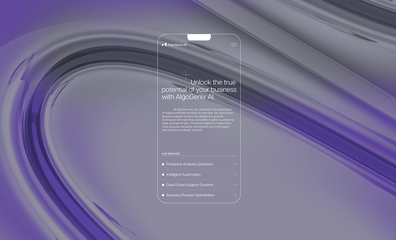
AlgoGenix AI
Florida, USA
AlgoGenix AI is a future-focused technology company specializing in advanced artificial intelligence and machine learning solutions for diverse industries.
It offers comprehensive, end-to-end services, including strategic consulting, custom development, and seamless deployment, each engagement tailored to specific industry needs, data sets, and business objectives.
The current AI landscape is crowded, with numerous companies making similar claims around innovation and scalability, making differentiation difficult. Many providers also appear overly technical or impersonal, which can alienate decision-makers and non-technical stakeholders.
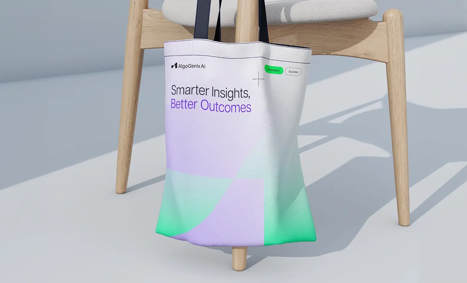
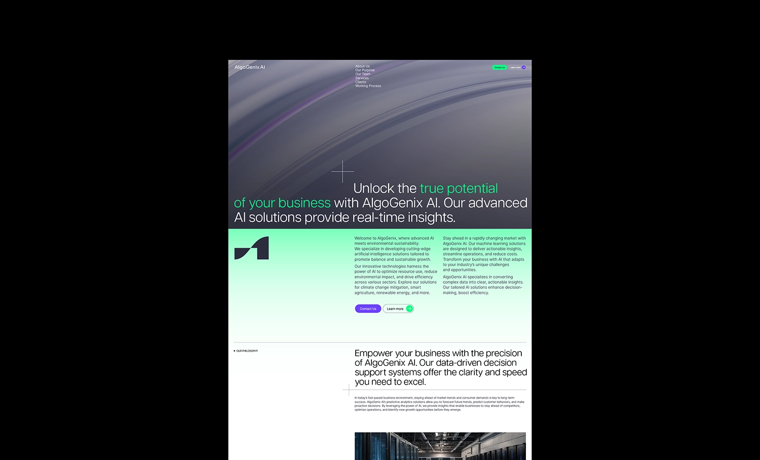
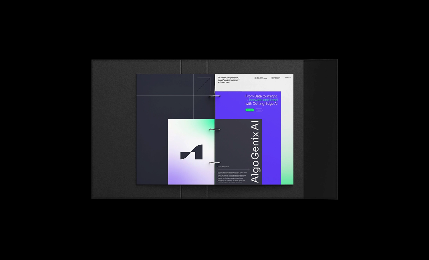
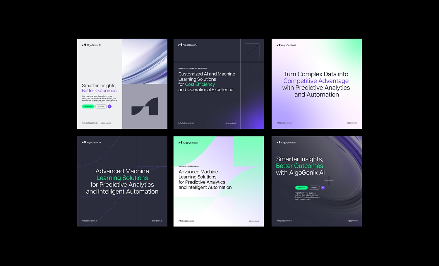
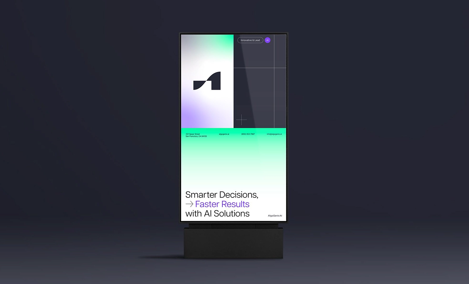
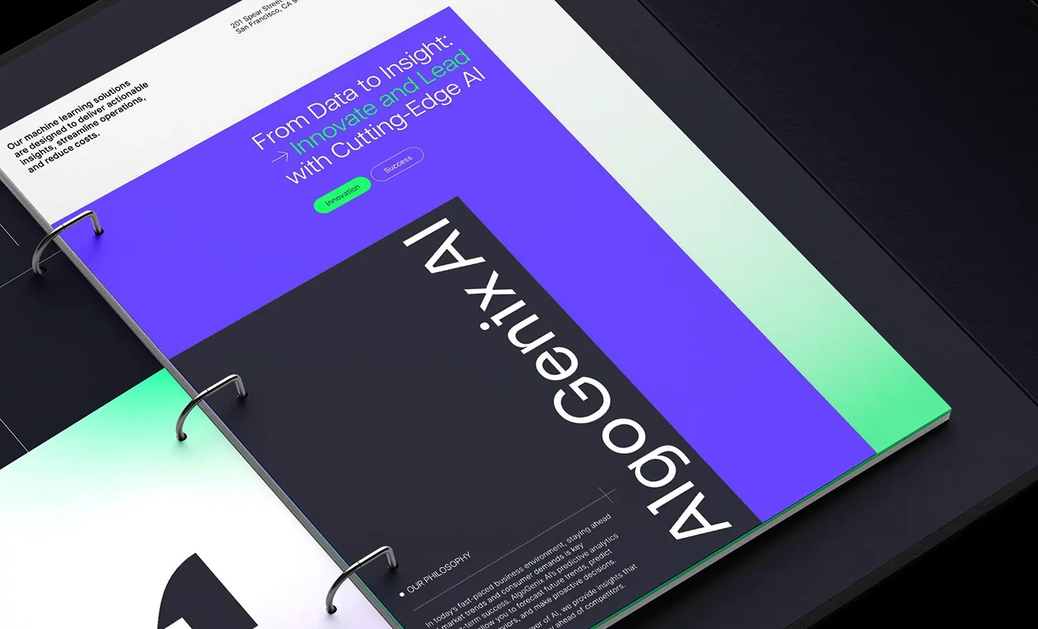
This highlights the need to communicate AI solutions in a way that’s both credible and easy to understand. To overcome these challenges, Andrea created a brand identity that balances technical sophistication with human warmth. Its design system features a blend of vibrant and pastel colors, abstract patterns, and a clean, futuristic aesthetic, conveying both complexity and clarity.
Andrea addressed a common challenge in emerging technology: the need to communicate complex AI solutions in a way that feels both credible and easy to understand. In a space often dominated by jargon-heavy language and sterile visuals, Andrea developed a brand identity that strikes a thoughtful balance between technical sophistication and human warmth.
The design system she crafted features a harmonious blend of vibrant and pastel tones, abstract patterns, and a clean, futuristic aesthetic. This visual language conveys both complexity and clarity, reflecting AlgoGenix's adaptable, forward-thinking approach while making advanced technology feel more approachable, engaging, and trustworthy.
By fusing elements of innovation with emotional accessibility, Andrea’s creative direction helped position AlgoGenix AI as a modern AI brand that doesn’t just showcase intelligence, but also builds connection and confidence with users. The result is an identity that transforms technical capability into an inspiring user experience, bridging the gap between algorithmic precision and human relevance.


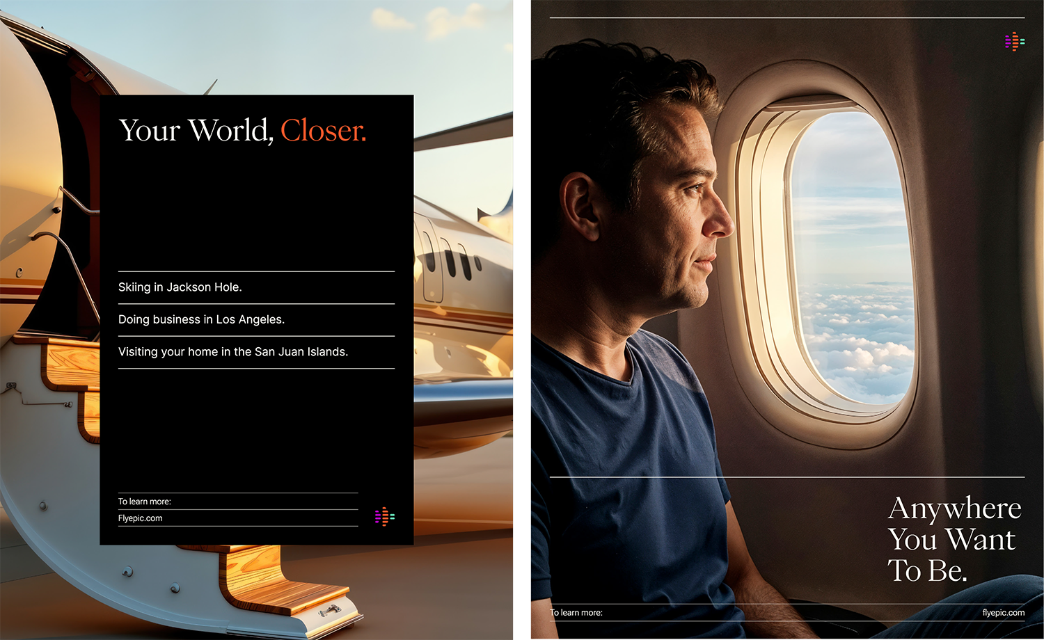
FlyEpic
Oregon, USA
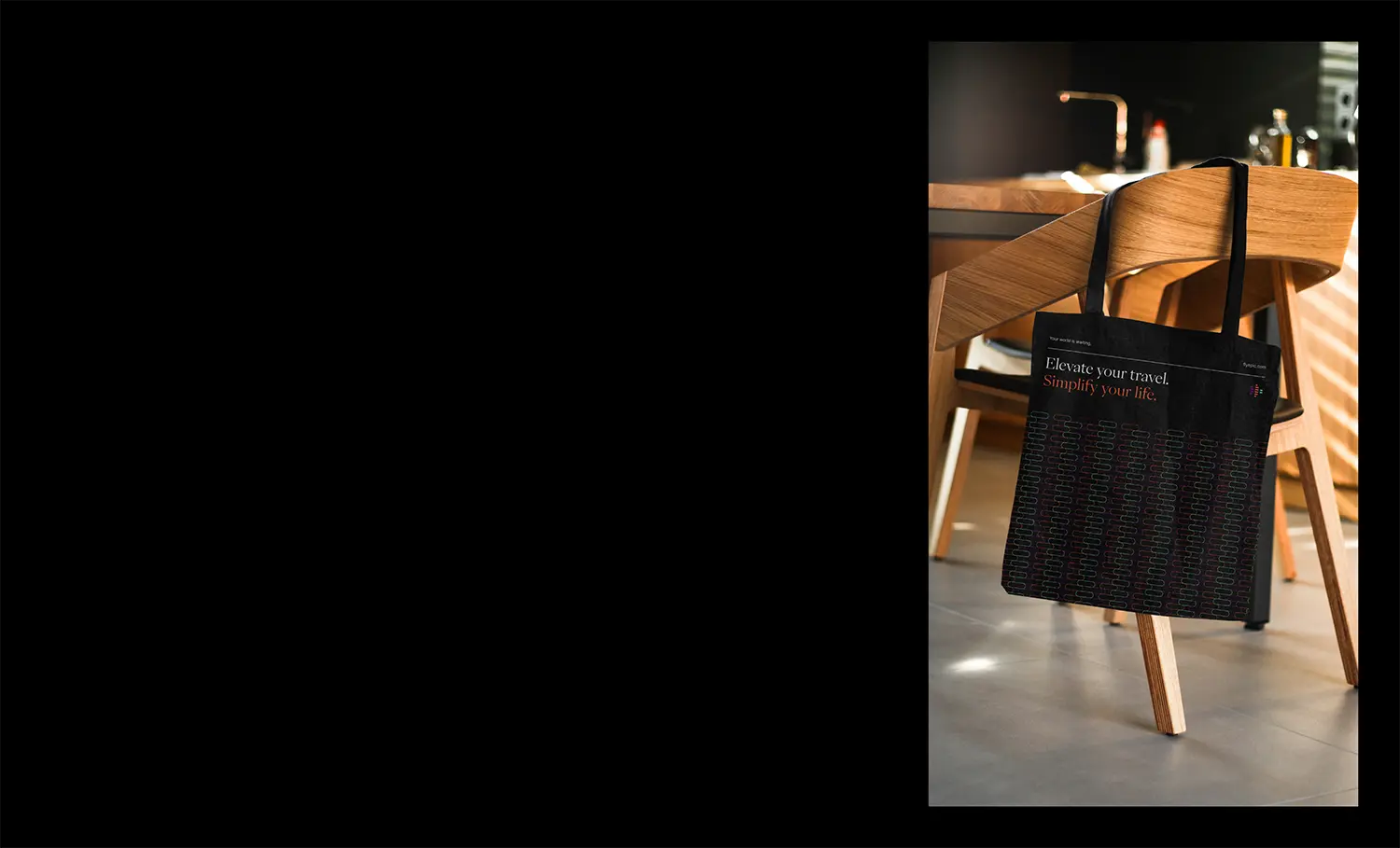
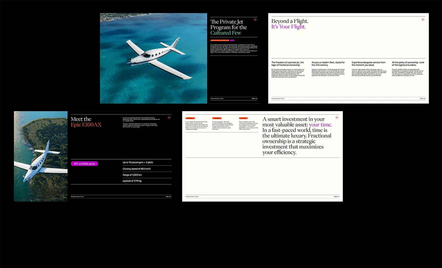
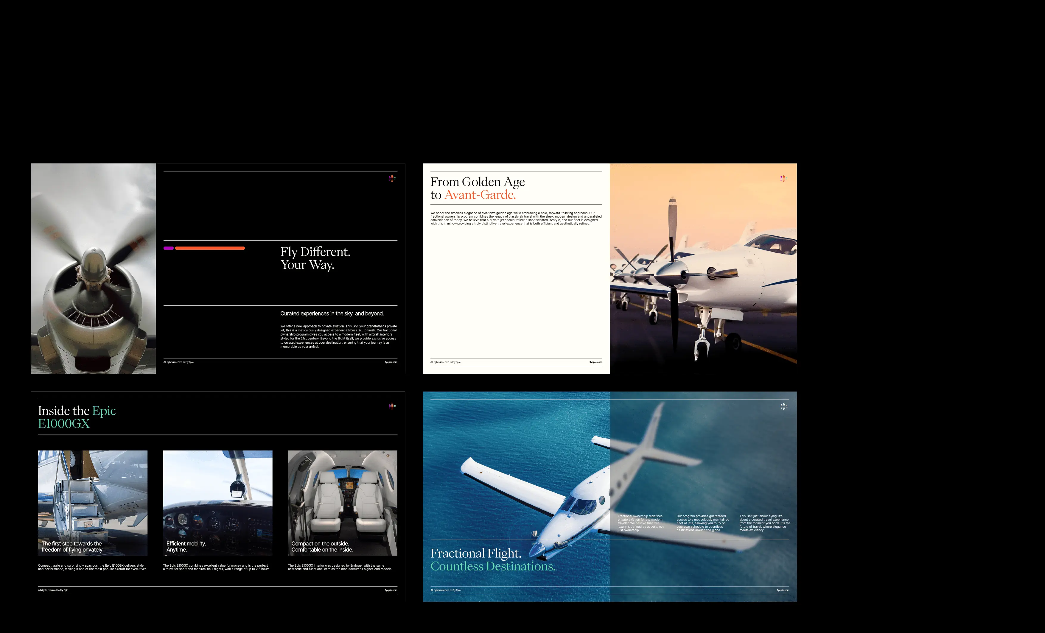
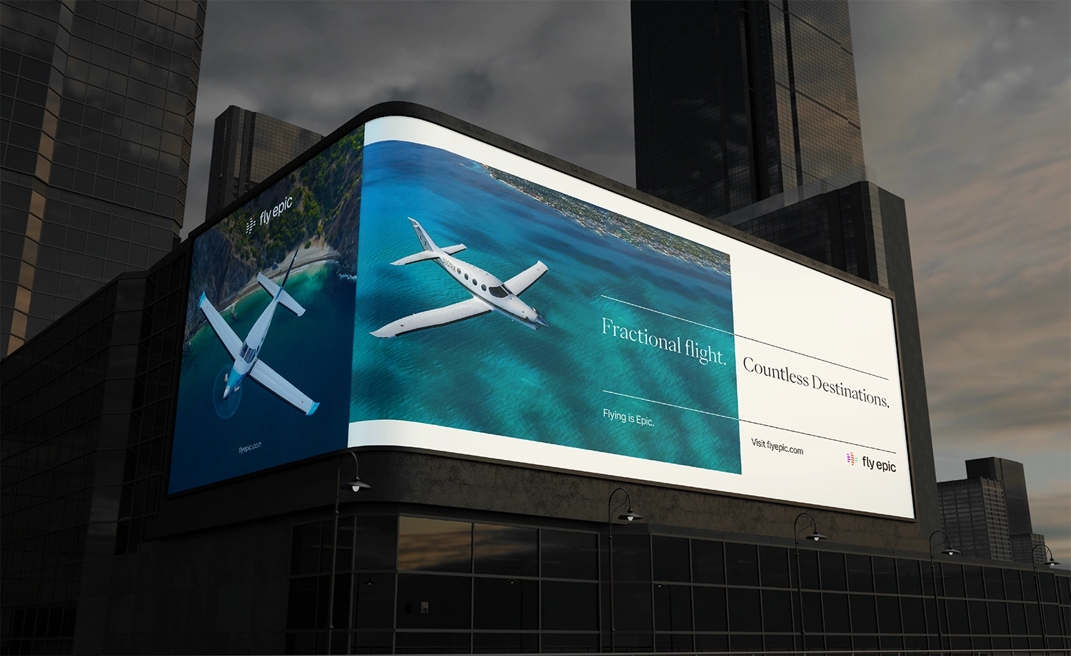
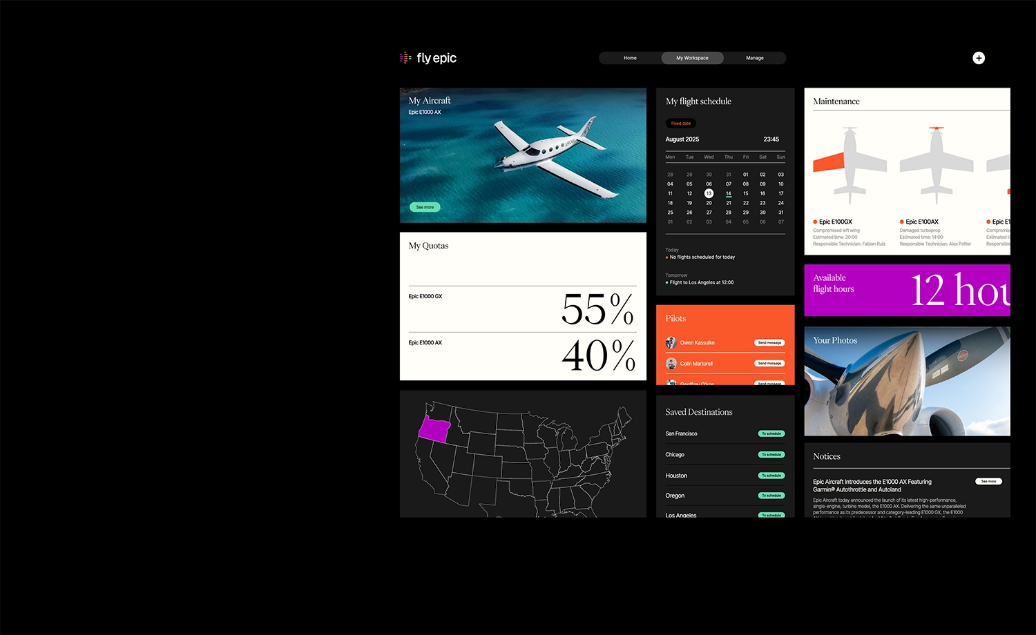
FlyEpic was founded to reimagine the traditionally rigid and status-driven world of private aviation. From its headquarters in Bend, Oregon, the company, led by two young entrepreneurs, draws inspiration from the golden age of flying, blending classic elegance with modern cultural relevance. More than just an aviation brand, FlyEpic offers a lifestyle experience built around design, access, and emotional connection.
Creating a brand identity for FlyEpic came with unique challenges. It needed to break away from the industry’s conservative visual norms without sacrificing professionalism or trust.
At the same time, it had to appeal to a new generation of wealth, experience-driven individuals who prioritize culture and conscious living. Positioning the brand as both premium and accessible was key, ensuring that it felt aspirational but not out of reach.
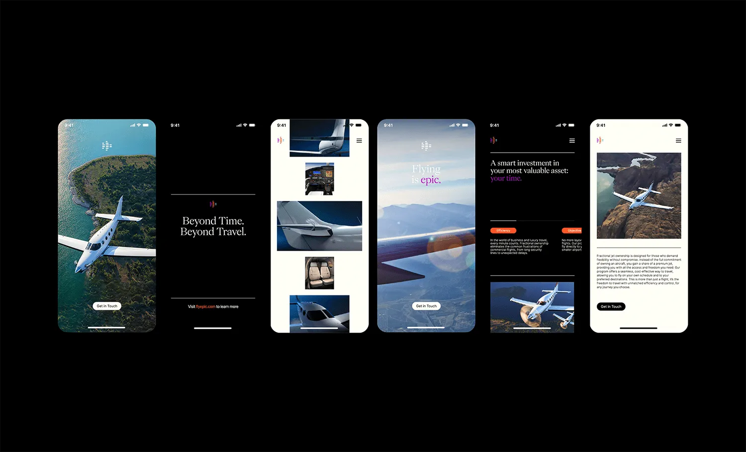
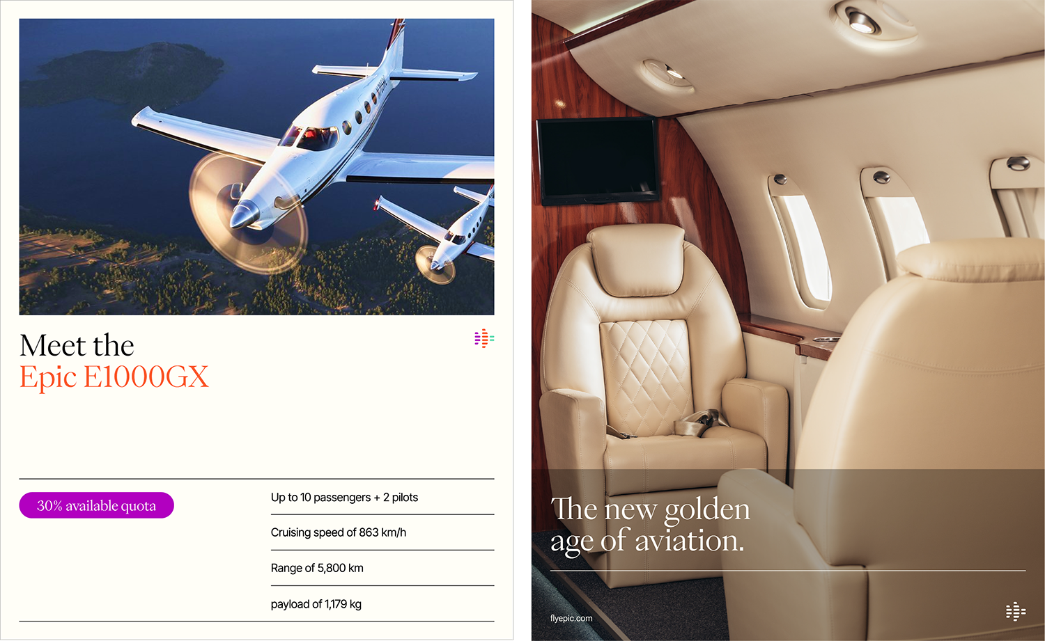
As Creative Director, Andrea brought a visionary, culture-driven approach to the development of FlyEpic’s brand identity. Her direction positioned FlyEpic not merely as a private aviation service, but as a lifestyle brand, one that reflects and amplifies the values of a new generation of luxury travelers. The solution was a bold, lifestyle-centric identity that redefined what it means to fly private in the modern era. Rather than leaning on outdated tropes of exclusivity or status, Andrea’s design system prioritized emotional resonance, focusing on selling experiences, aspirations, and cultural belonging instead of just flights. This shift allowed FlyEpic to connect more authentically with its audience, inviting them to see themselves as part of a larger, aspirational movement.
Her creative direction introduced a carefully calibrated aesthetic that blends timeless sophistication with youthful energy a balance that appeals to both established clientele and emerging luxury consumers. The brand feels premium but not pretentious; elevated, yet emotionally accessible. Each visual and verbal element is meticulously designed to scale across touchpoints, ensuring consistency without compromising personality or integrity as the brand grows.
Andrea also infused the brand with a unique fusion of aviation credibility and cultural fluency, grounding FlyEpic in technical expertise while keeping it in tune with art, fashion, design, and global lifestyle trends. This synthesis not only differentiates FlyEpic in a crowded and often conservative market but also positions it as the future of private air travel: design-forward, inclusive, and deeply connected to the ethos of modern luxury. Her creative direction didn't just shape a brand, it established a movement. One where air travel becomes an extension of identity, taste, and self-expression, redefining luxury as something lived, not just purchased.
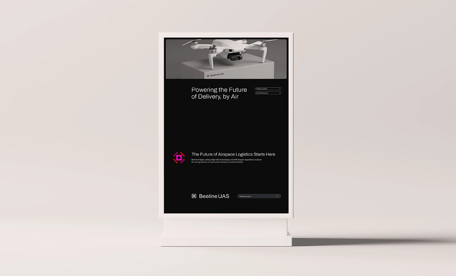
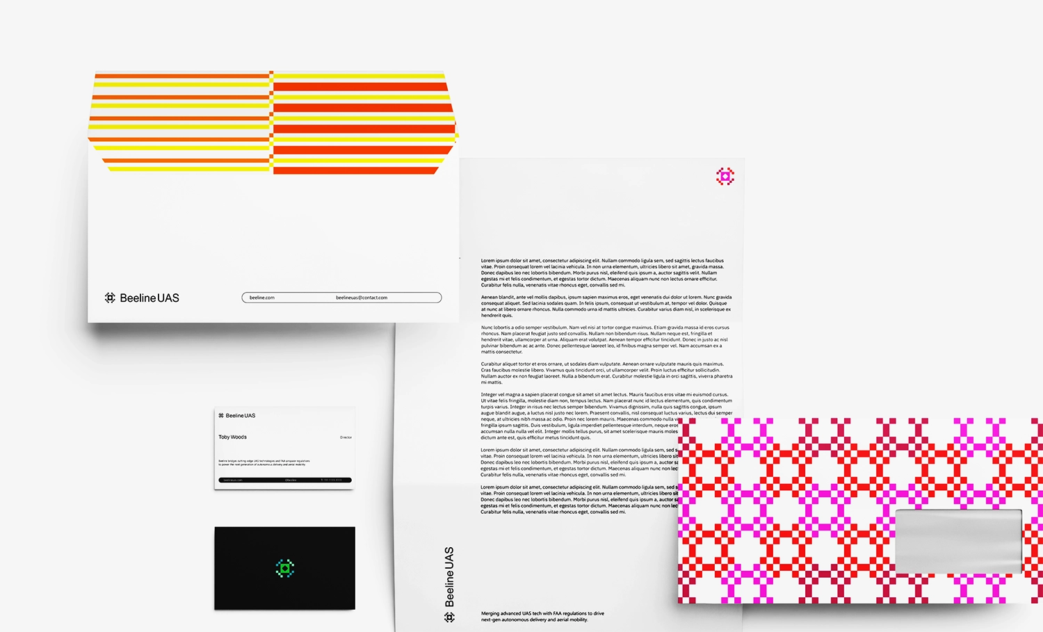
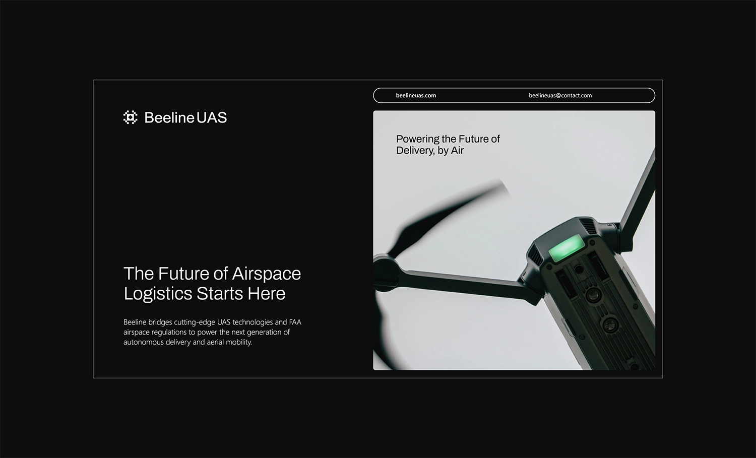
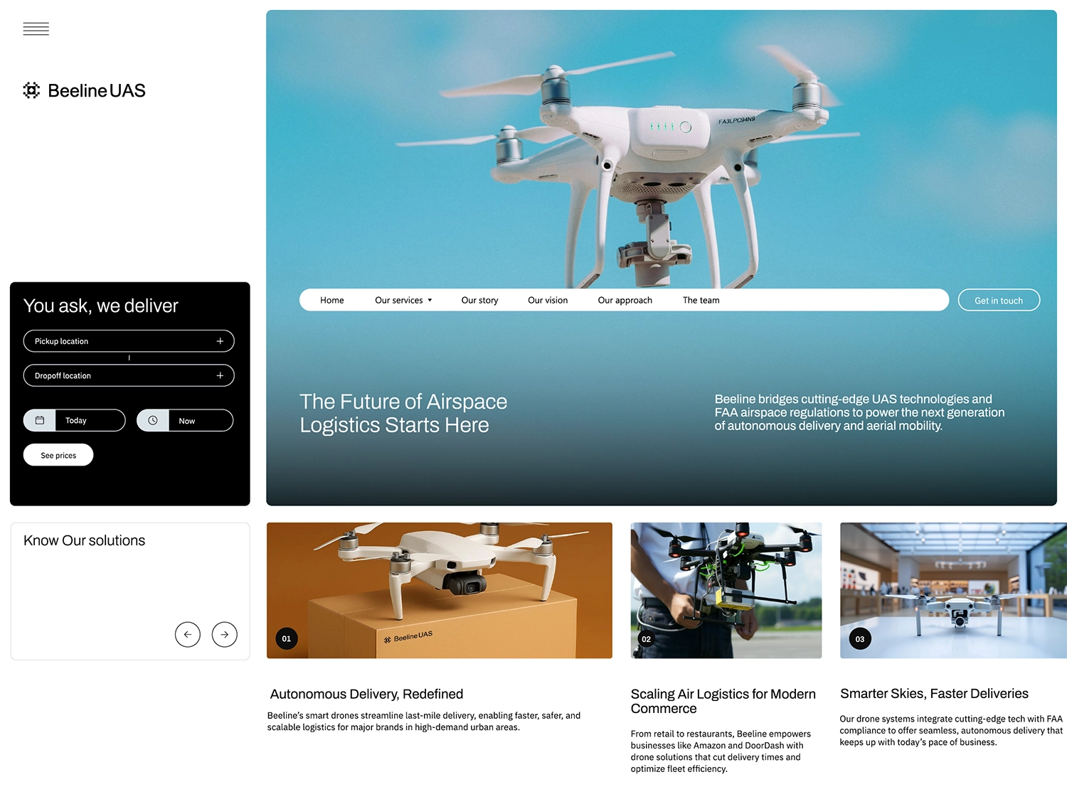
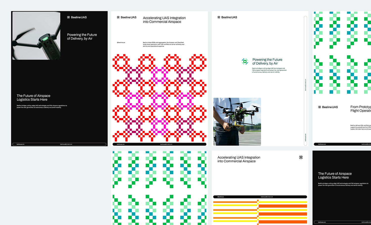
Beeline
Oregon, USA
Beeline is a B2B operations firm that integrates emerging unmanned aerial systems (UAS) into the national airspace, supporting major platforms like Amazon, DoorDash, and Uber Eats by bridging the gap between innovation and FAA compliance. It stands out for its FAA air carrier certificate and deep regulatory expertise, offering scalable, drone-agnostic delivery solutions.
With a mission to make drone delivery safe, affordable, and accessible nationwide, Beeline is driven by core values of kindness, creativity, and grit.
Establishing Beeline’s brand identity required balancing the innovative nature of UAS technology with the professionalism demanded by aviation regulation. The challenge lay in communicating a clear, differentiated value proposition in a highly technical space, while emphasizing Beeline’s drone-agnostic, scalable operations model.
The brand also needed to reflect the founder’s compelling journey without relying solely on it, and convey approachability in an industry often marked by formality—achieved by embedding its core values of kindness, creativity, and grit into a flexible, credible, and forward-looking identity.
Beeline’s brand identity was crafted to strike a precise balance between aviation-grade professionalism and forward-thinking innovation. Her approach positioned Beeline as a strategic, drone-agnostic partner—focused not on hardware, but on delivering measurable outcomes such as efficiency, compliance, and operational clarity.
Andrea developed a visual and verbal system that seamlessly blends stability with energy. Through clean layouts, bold accents, and accessible, outcome-driven messaging, the brand communicates a tone that is polished yet approachable—confident without being cold, professional without being impersonal.
To distinguish Beeline in a rapidly evolving, future-facing market, Andrea introduced a subtle layer of eccentricity via custom prints and playful patterns. These design elements provide moments of visual delight and infuse the identity with a sense of
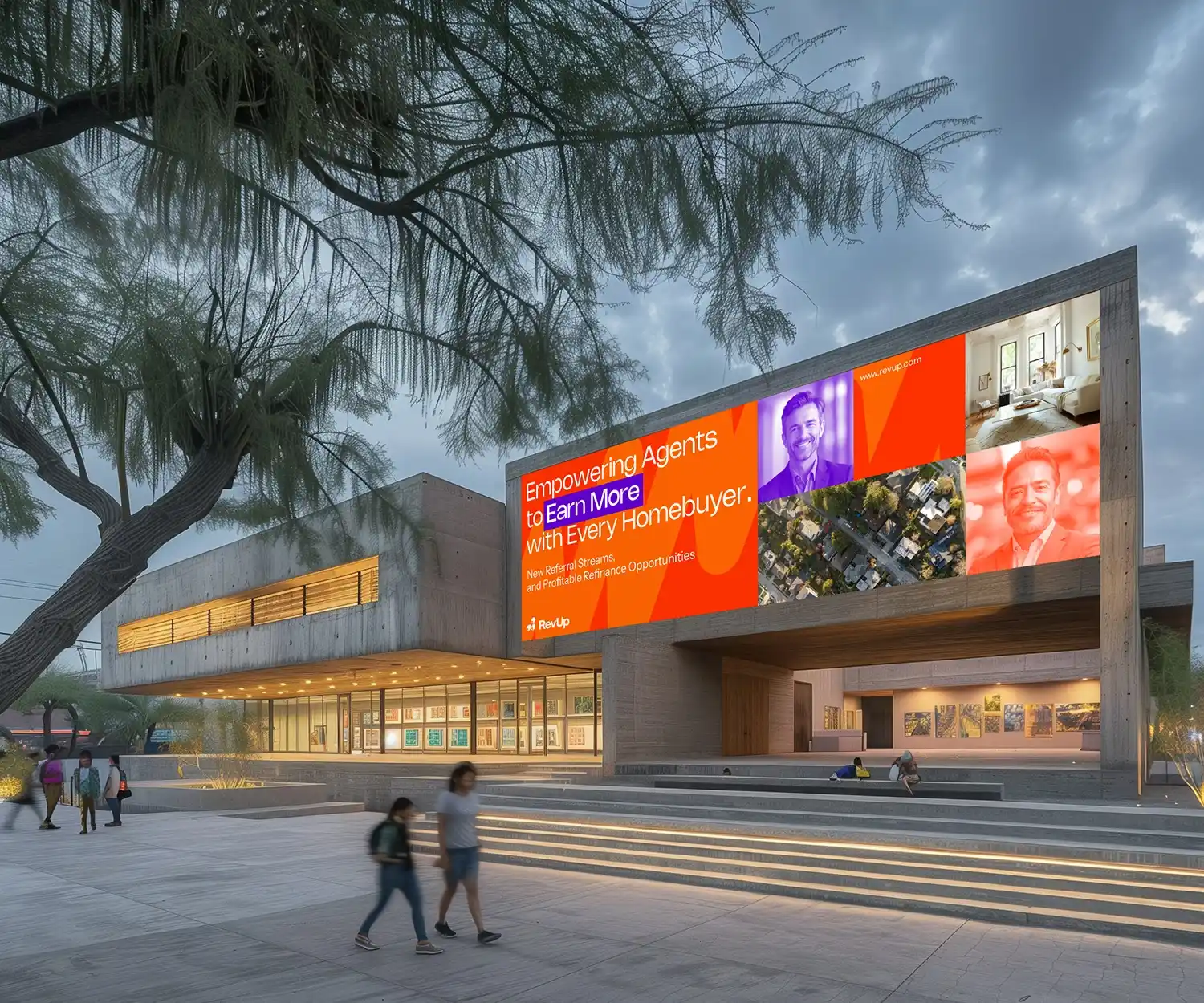
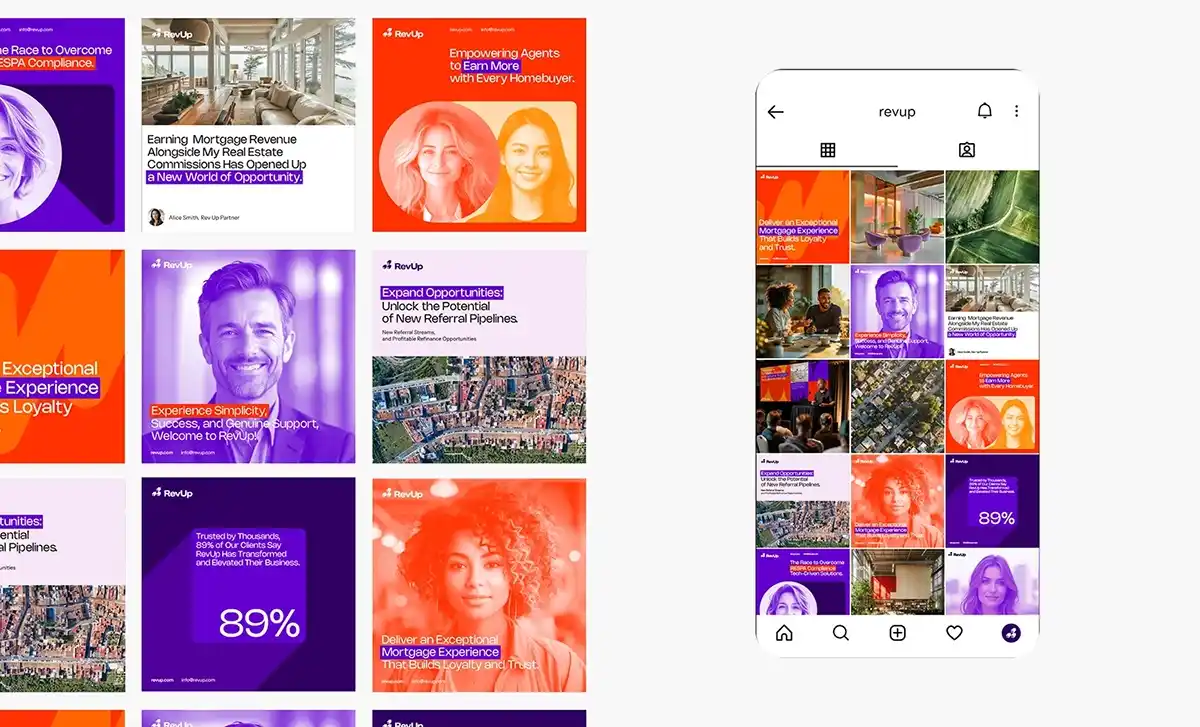
RevUp
NY State, USA
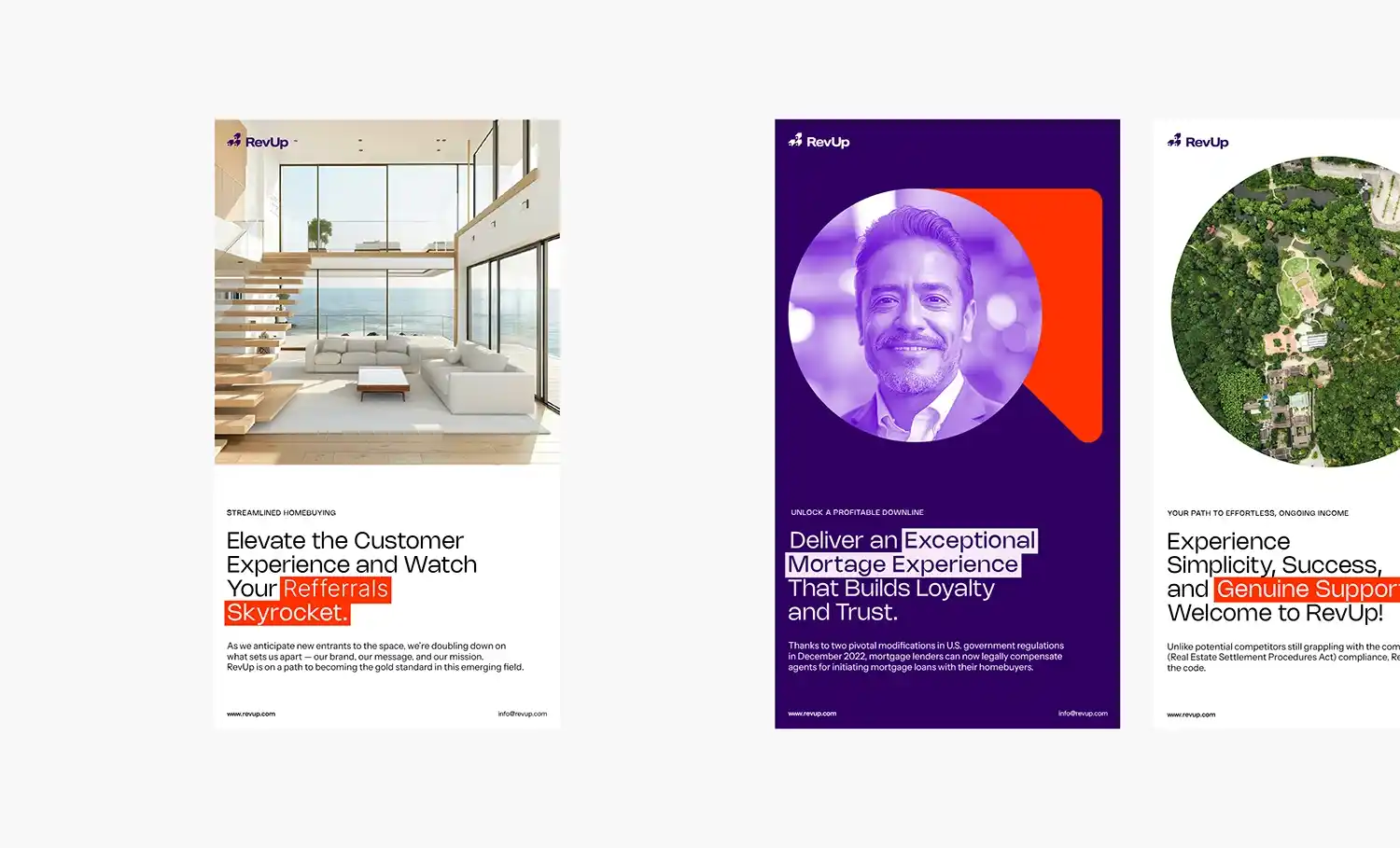
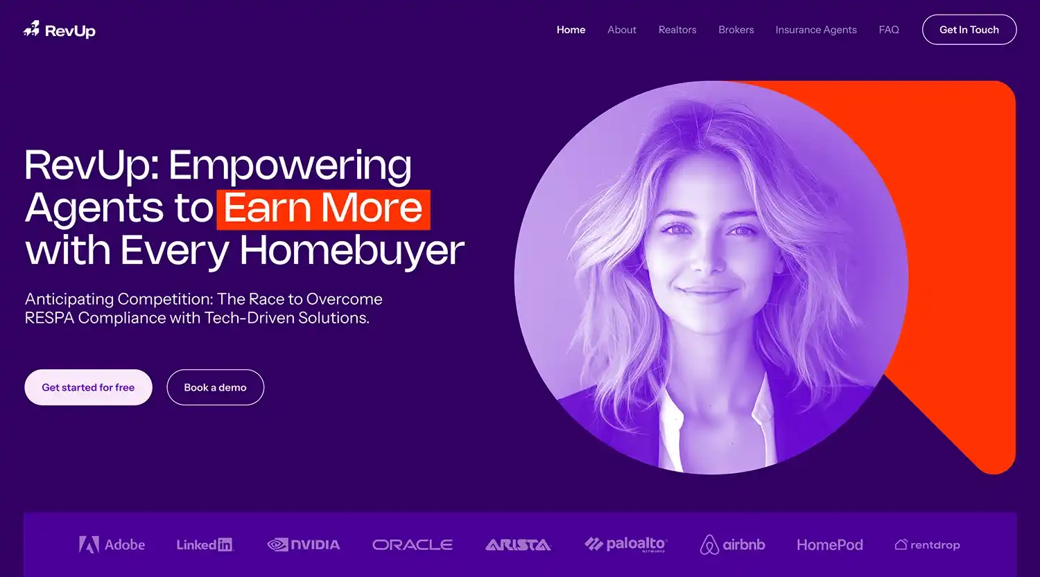
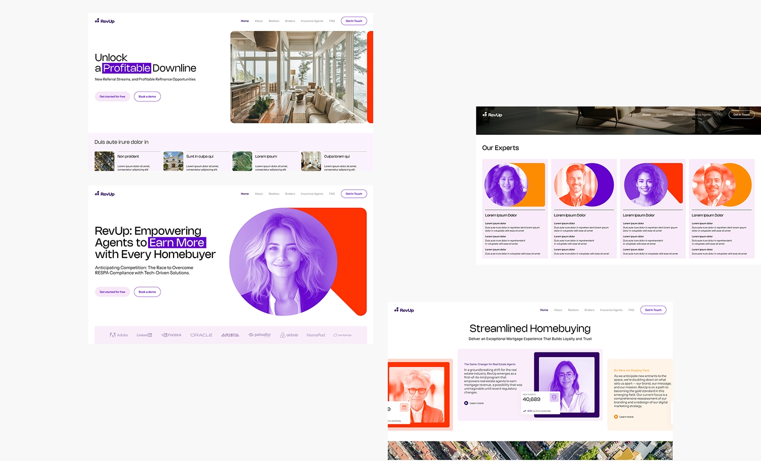
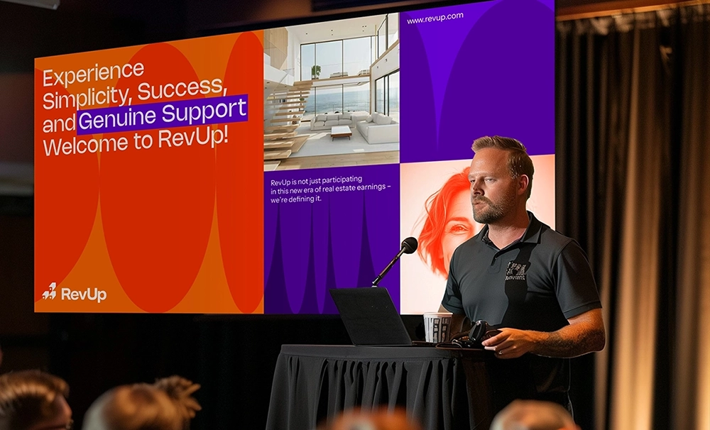
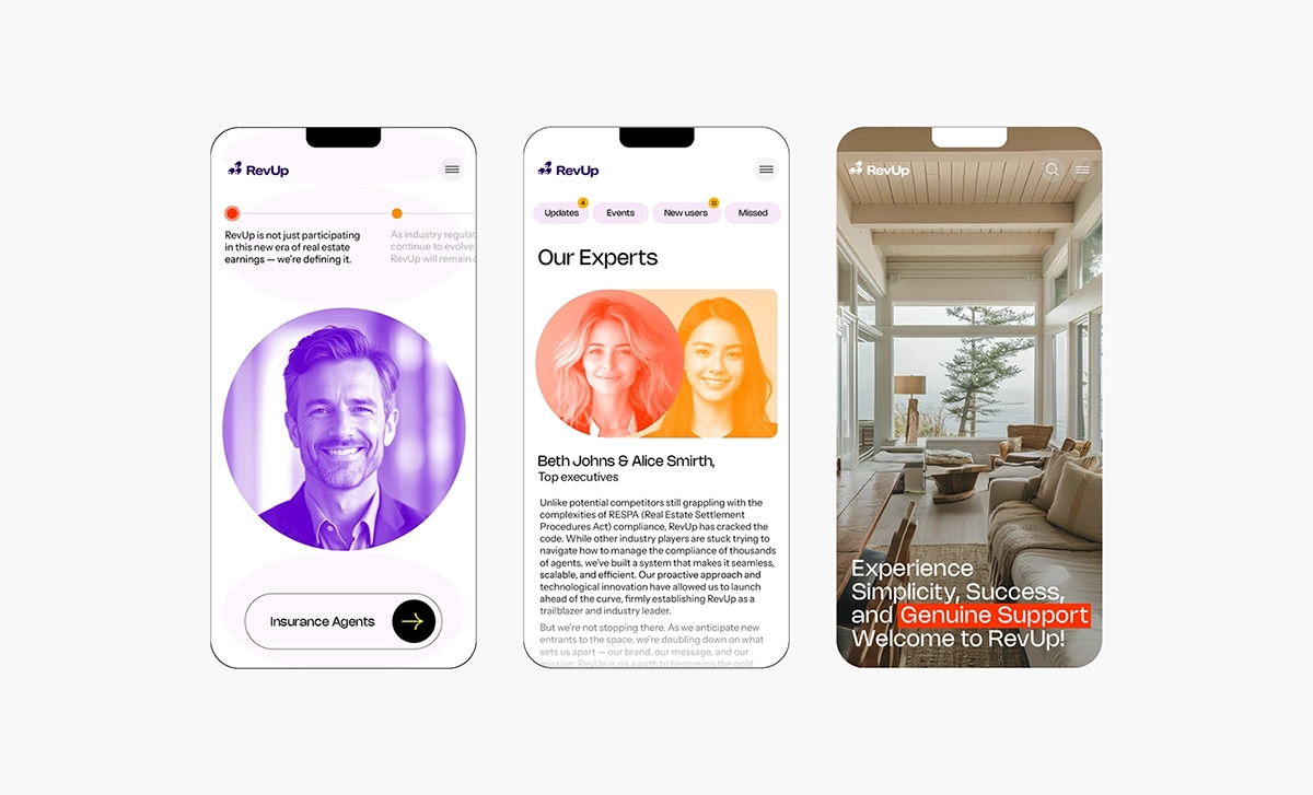
RevUp is a mortgage revenue platform designed to help real estate agents, teams, and brokerages unlock a powerful new income stream, earning mortgage revenue in full compliance with RESPA and other industry regulations.
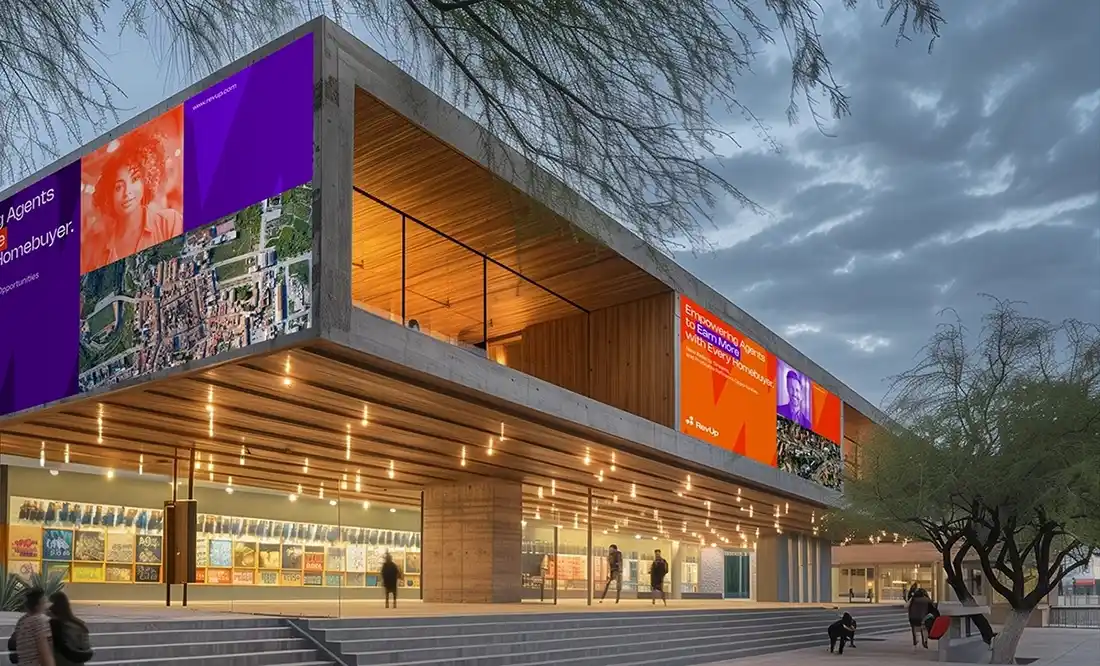
The RevUp NY rebrand, led by Andrea, revitalizes a groundbreaking program that empowers U.S. real estate agents to participate in mortgage revenue, a model enabled by key regulatory changes enacted in December 2022. As the industry’s first mover, RevUp sets the standard by tackling challenges that have long deterred competitors, ensuring that its refreshed brand identity reflects both innovation and leadership.
As it expands into a new U.S. market, RevUp faces several core challenges: building trust in a highly regulated space, standing out from a growing field of competitors, ensuring ongoing RESPA compliance, and refining its brand presence to align with its pioneering model.
Andrea’s solution centered on striking a thoughtful balance between energy, innovation, and professionalism, positioning RevUp to drive meaningful disruption across the mortgage and real estate landscape.
The resulting brand identity is bold, dynamic, and forward-thinking. It incorporates a refined color palette and modern typography designed to convey trust, growth, and expertise. Simultaneously, the brand emphasizes clarity, inclusivity, and simplicity, establishing a presence that is vibrant, approachable, and credible.
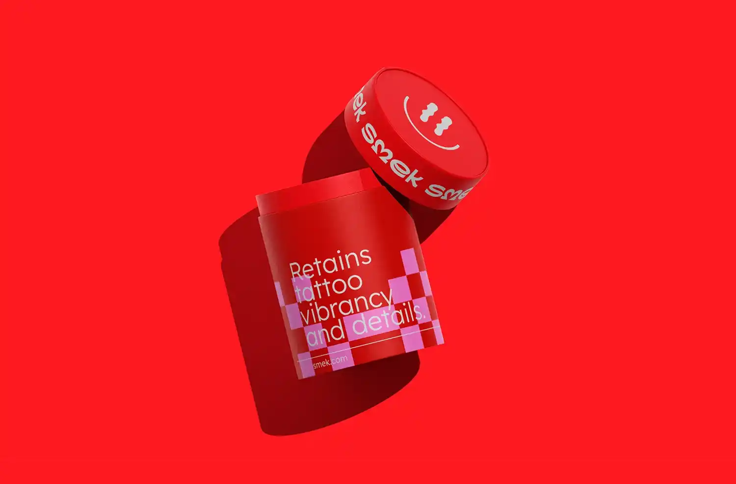
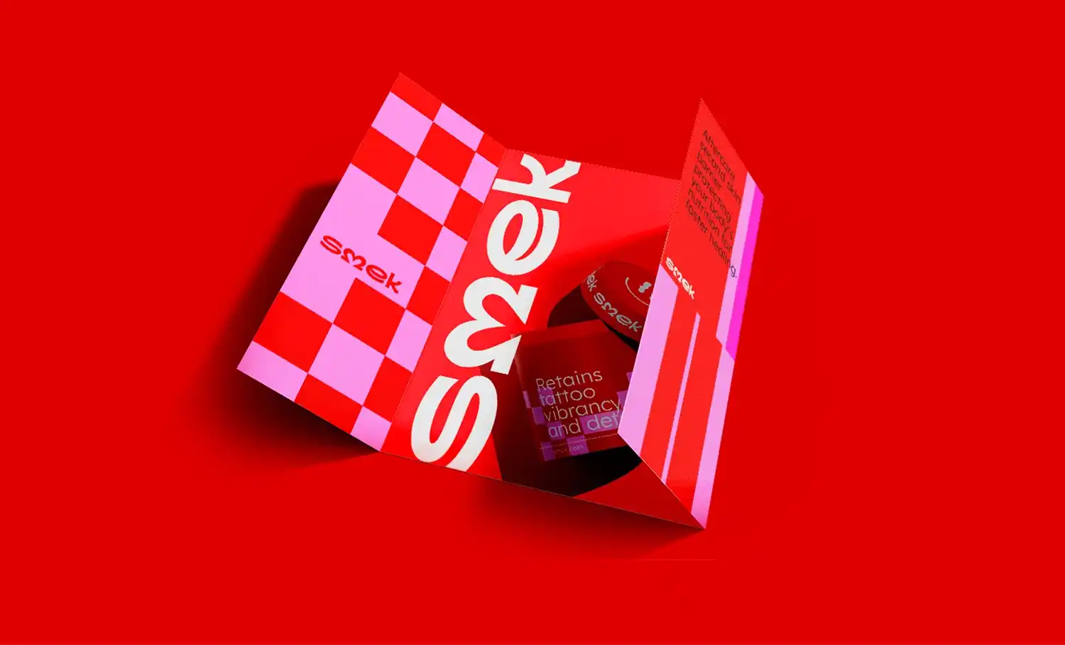

Smek
Sydney, Australia
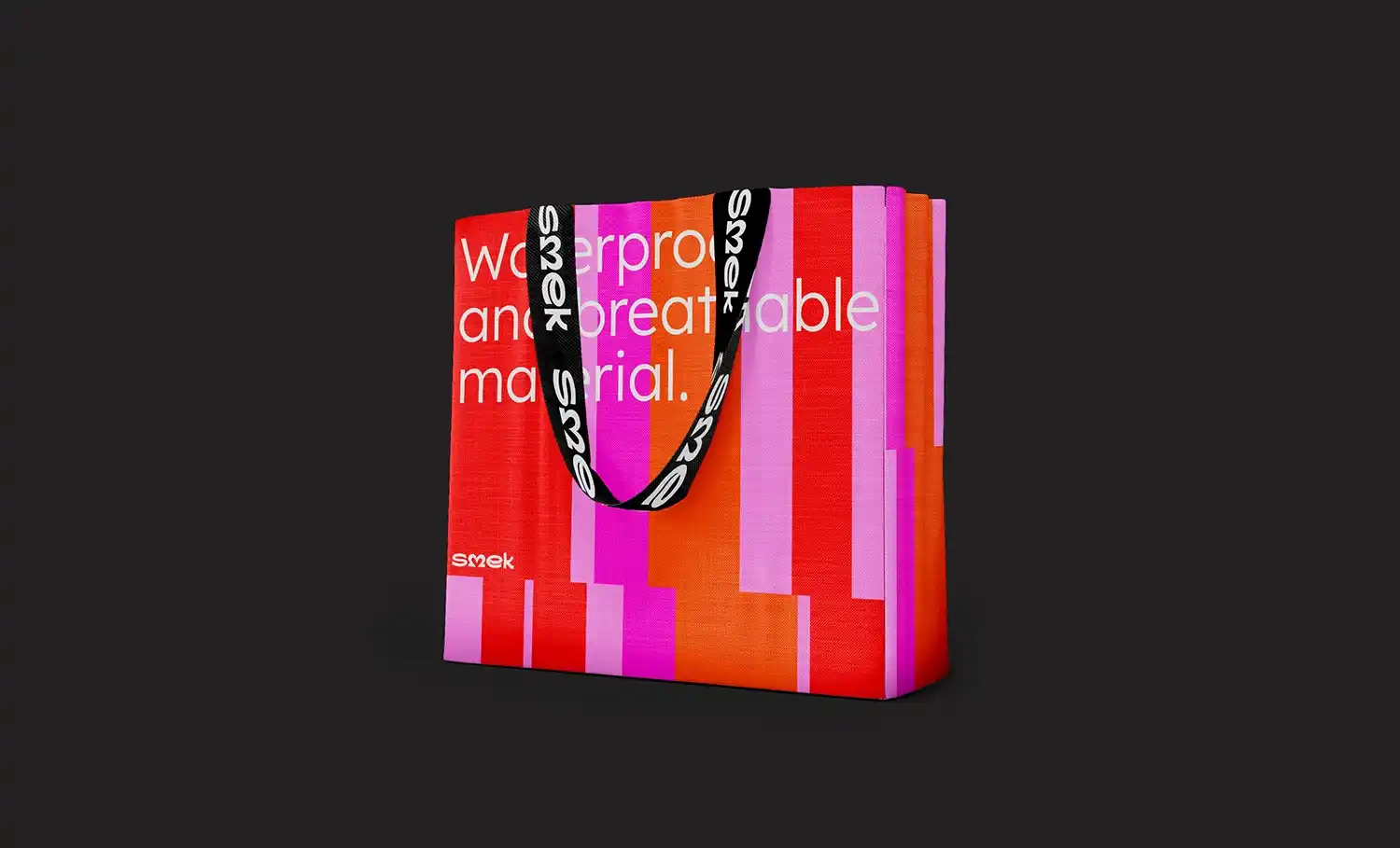
Smek is a high-performance, second-skin tattoo aftercare solution designed to accelerate healing while preserving the color, clarity, and detail of fresh tattoos. Its breathable, waterproof barrier protects against bacteria and infection, offering a significant improvement over traditional ointments and plastic wraps. Clinically effective and easy to use, Smek introduces a new level of convenience and consistency to the aftercare process.
As Creative Director, Andrea Moitinho played a pivotal role in shaping Smek’s identity, guiding the brand from concept to execution with a distinctive and strategic vision. The core challenge was finding the right balance between medical-grade trust and a playful, user-friendly appeal, a unique blend essential for engaging both first-time tattoo clients and seasoned collectors.
Beyond attracting a diverse user base, the brand also needed to introduce and explain a new category of tattoo aftercare, an educational challenge that required clarity and creativity in equal measure.
Andrea's solution was a bold, cohesive identity built around vibrant colors, clean graphic elements, and approachable typography. She crafted a tone of voice that is cheeky yet reassuring, transforming tattoo aftercare from a dull necessity into a fun, empowering extension of the tattooing journey. Her creative direction helped position Smek not just as a functional product, but as a brand experience, one that celebrates self-expression and healing simultaneously.
Thanks to Andrea’s leadership, Smek successfully carved out a distinctive space in a saturated market dominated by sterile medical brands or overly aggressive, edgy aesthetics. Under her direction, the brand feels fresh, modern, and relatable, turning healing into a continuation of creativity rather than a clinical chore.
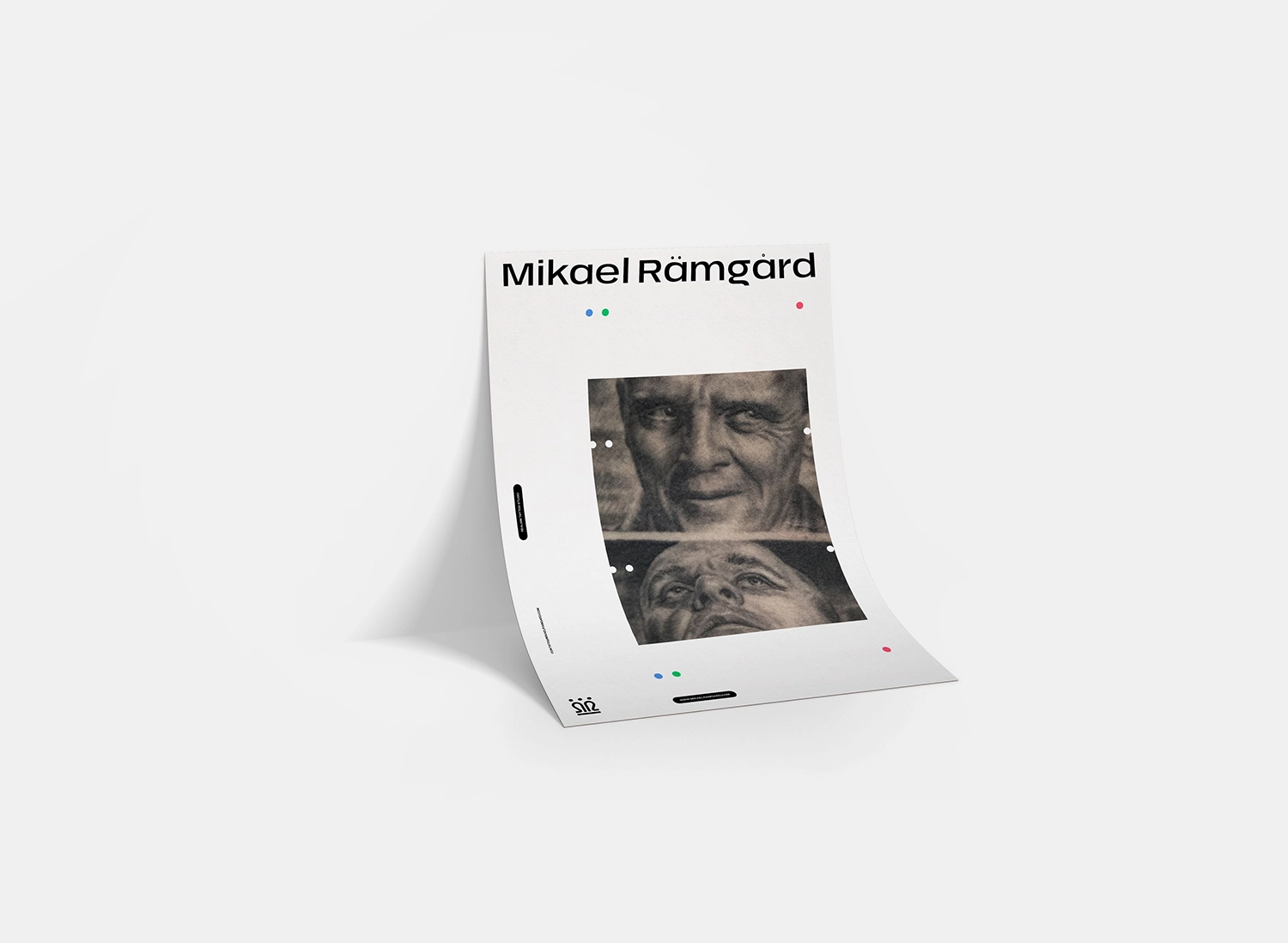
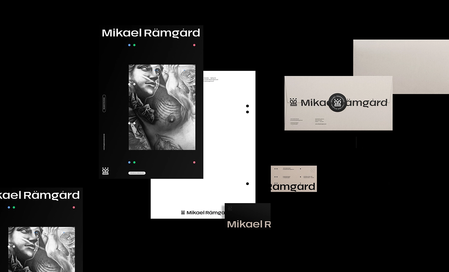
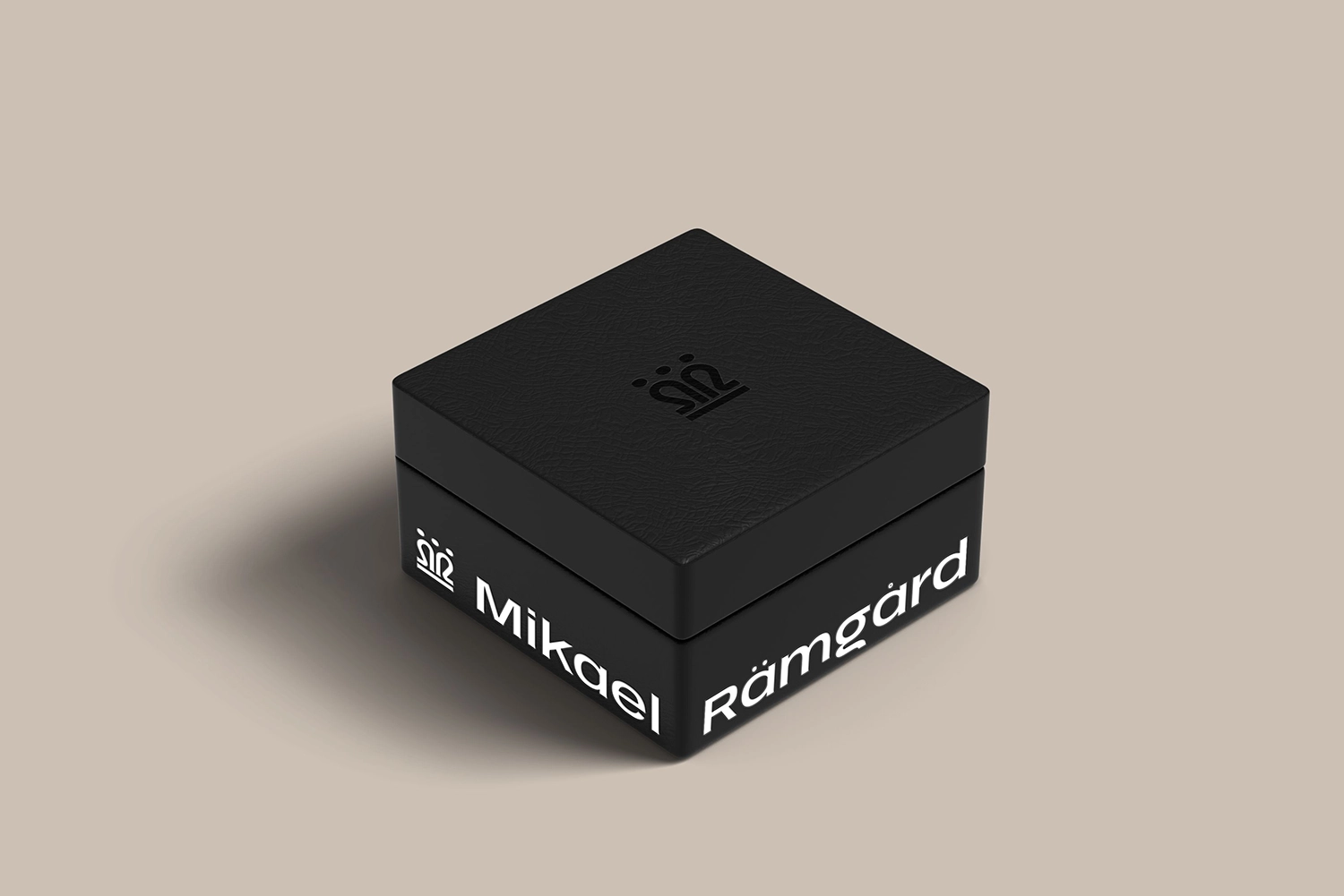
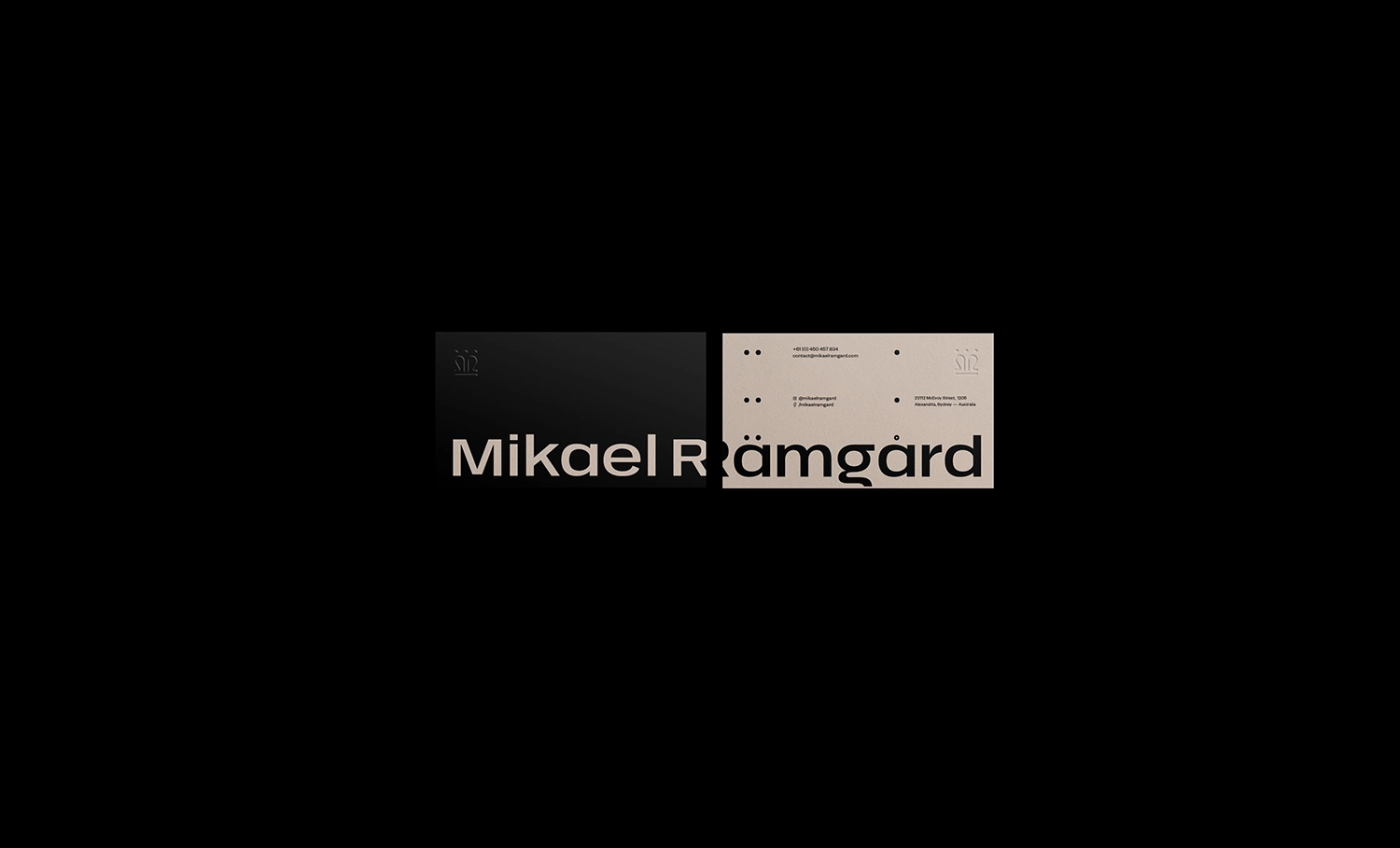
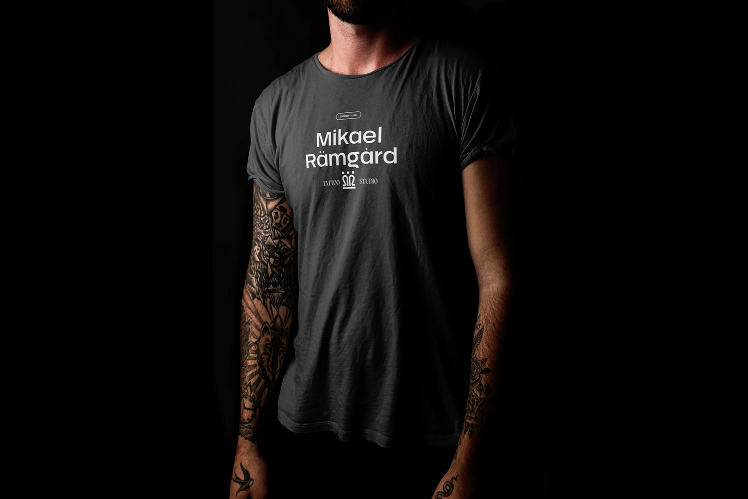
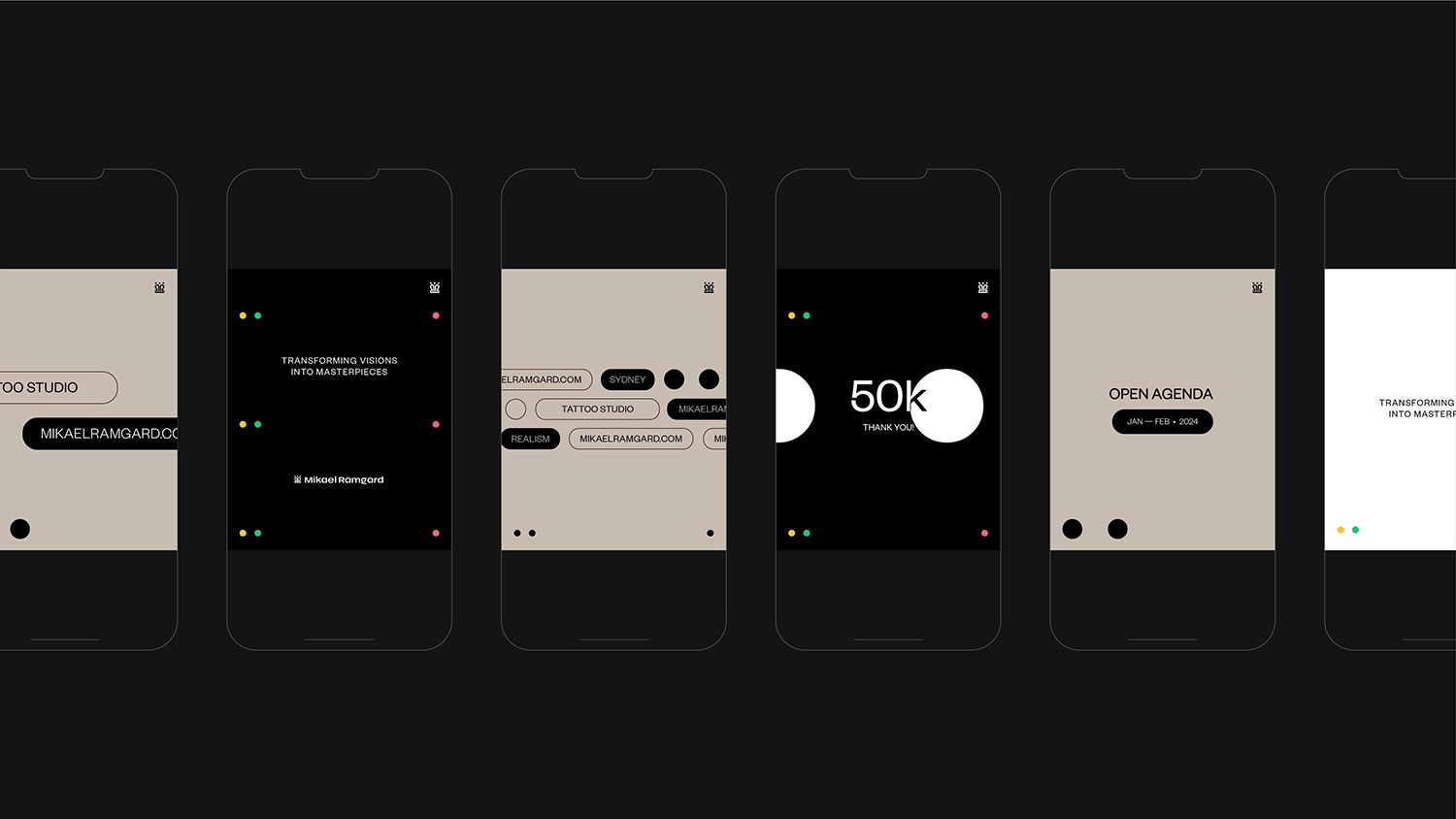
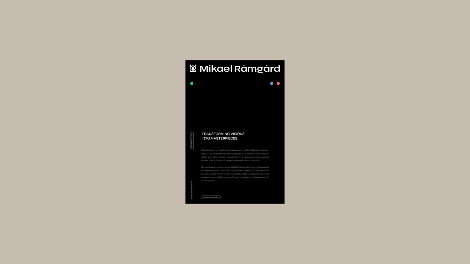
Mikael Ramgard
Sydney, Australia
Mikael Rämgård is a Swedish tattoo artist celebrated for his precision and artistry in Realism, with international recognition in black and grey, portrait, and realism categories.
While his work speaks volumes, his brand identity lacked the same level of refinement and innovation that defined his tattooing style. Our goal was to reposition Mikael as not just a master of his craft, but as a forward-thinking leader in the tattoo industry.
Andrea addressed the disconnect between his art and his brand through a sophisticated, minimalist visual language, anchored by a clean color palette, carefully selected typography, and a logo that conveys authority, precision, and timeless style.
The final brand identity is sharp, elegant, and future-focused, seamlessly aligning with Mikael’s world-class reputation. It not only supports his growth as an artist but also positions him as a visionary shaping the next era of modern tattoo culture. Every design element, from the refined logo to the minimal visual language, works in harmony to reflect the depth and precision of his craft.
This unified aesthetic creates a lasting impression and establishes Mikael as both a creative force and a brand with enduring impact.
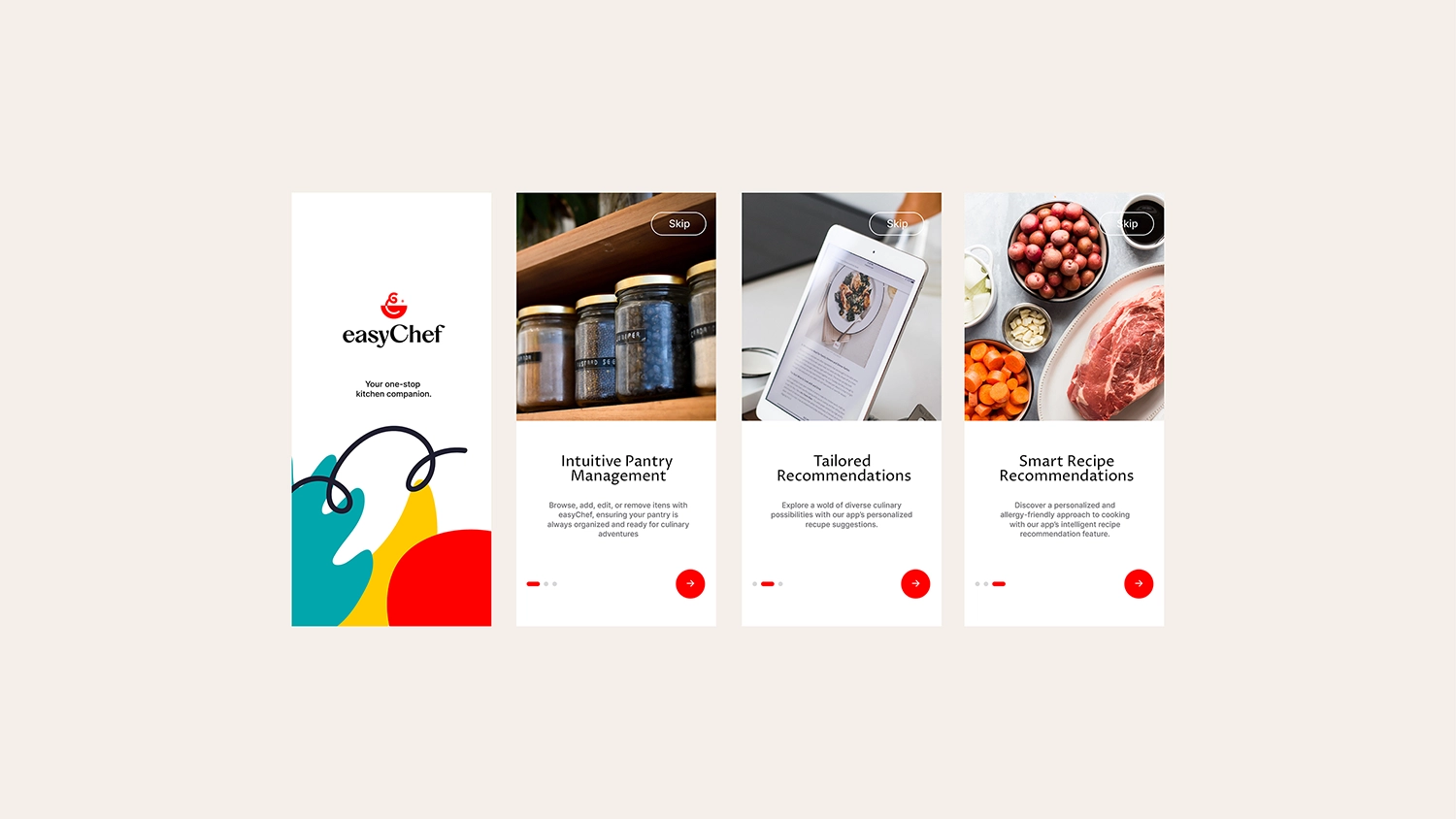

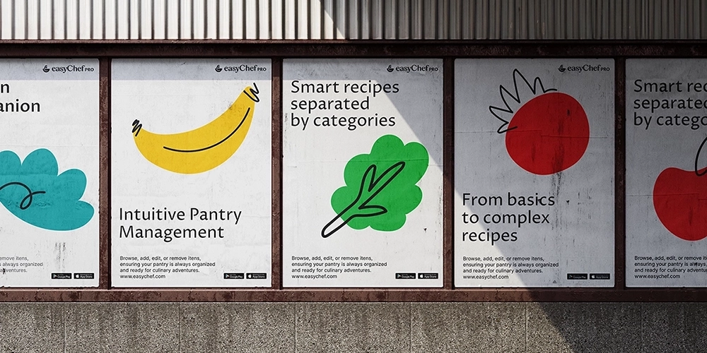
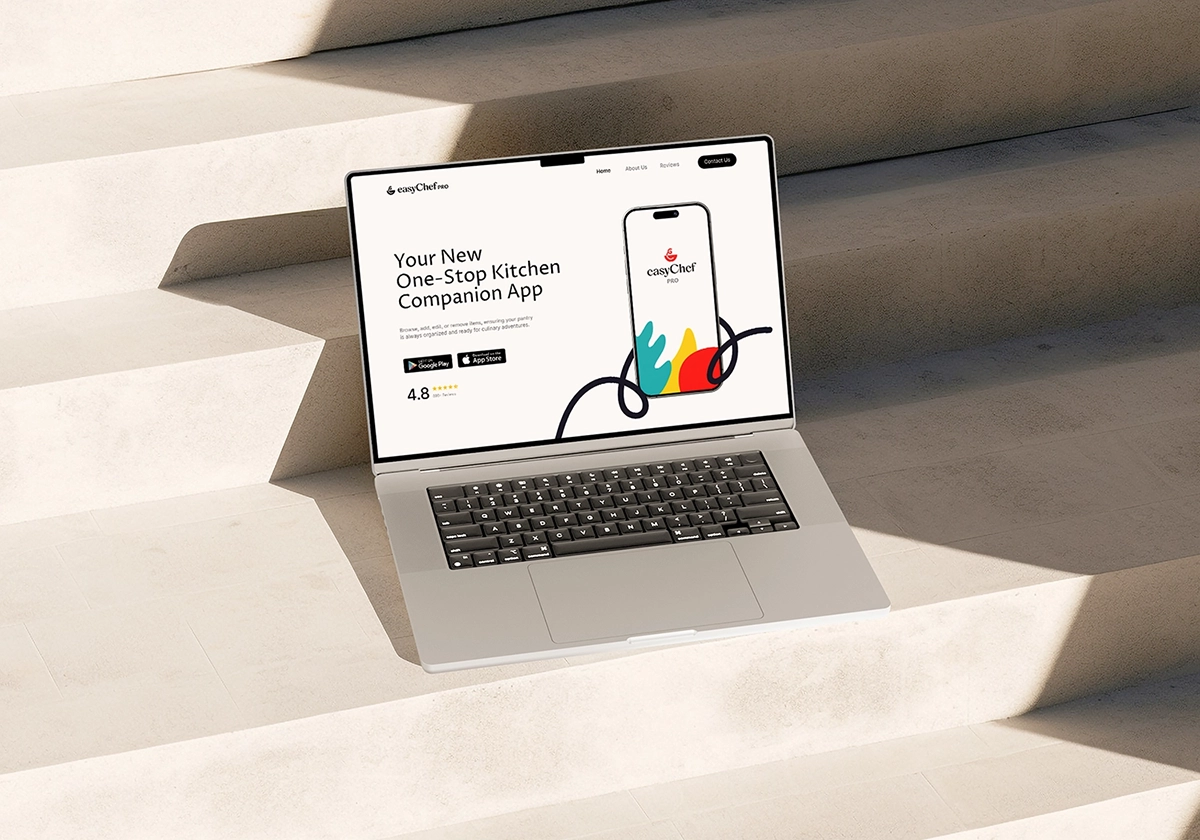
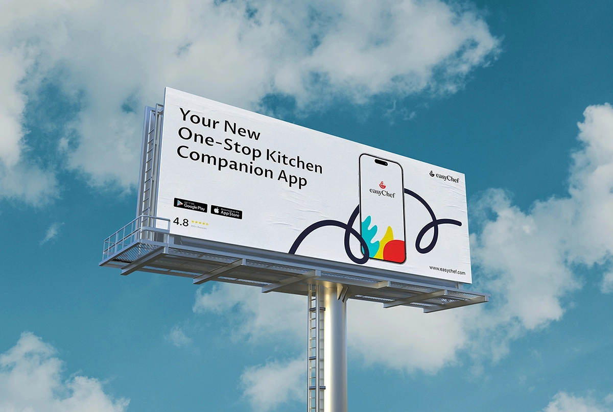

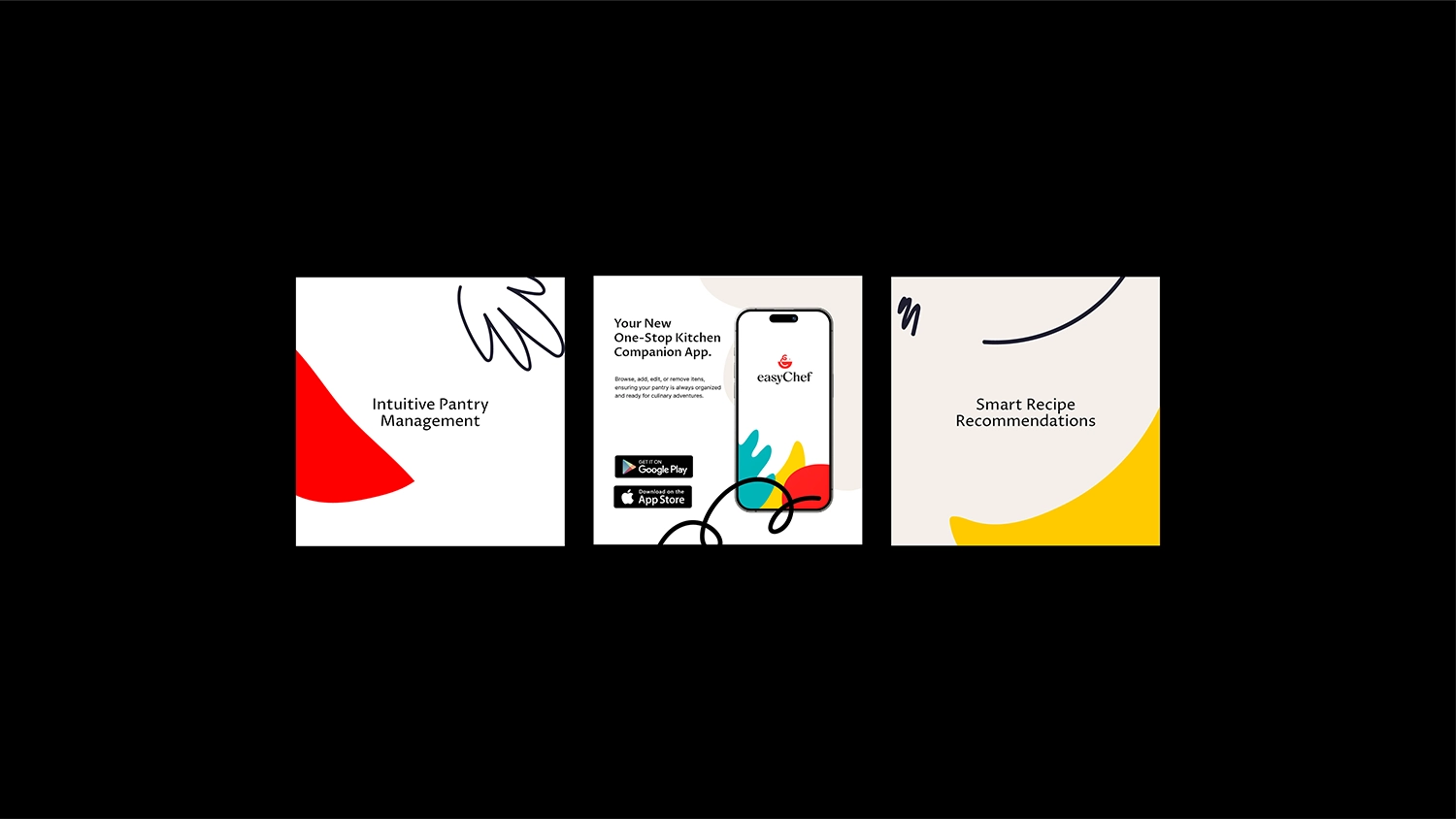
EasyChef
Nevada, USA
Step into the world of effortless cooking with Easy Chef Pro, the intuitive app that redefines the at-home kitchen experience. Designed to empower users of all skill levels, the app makes cooking approachable, enjoyable, and visually engaging.
The challenge was to create a brand identity that would reflect the app’s simplicity while also standing out in a saturated market of food and cooking apps. To solve this, we focused on a visual language that blends playfulness with clarity.
Andrea brought the brand to life using fun, simple line tracings and charismatic shapes in motion—provoking curiosity and encouraging user interaction. A vibrant color palette against a clean white background served as the perfect foundation for animated, cheeky movements that reflect the energy and personality of the app.
These creative choices allowed us to position the brand as approachable, modern, and full of personality. The result is a bold yet accessible identity that delivers both visual delight and strategic clarity. Easy Chef Pro is now not only a functional cooking companion, but also an engaging brand that sparks joy, builds awareness, and drives user acquisition.
From playful accents to intuitive design, every element was crafted to create a fun, seamless cooking experience, transforming everyday meals into moments of creativity.
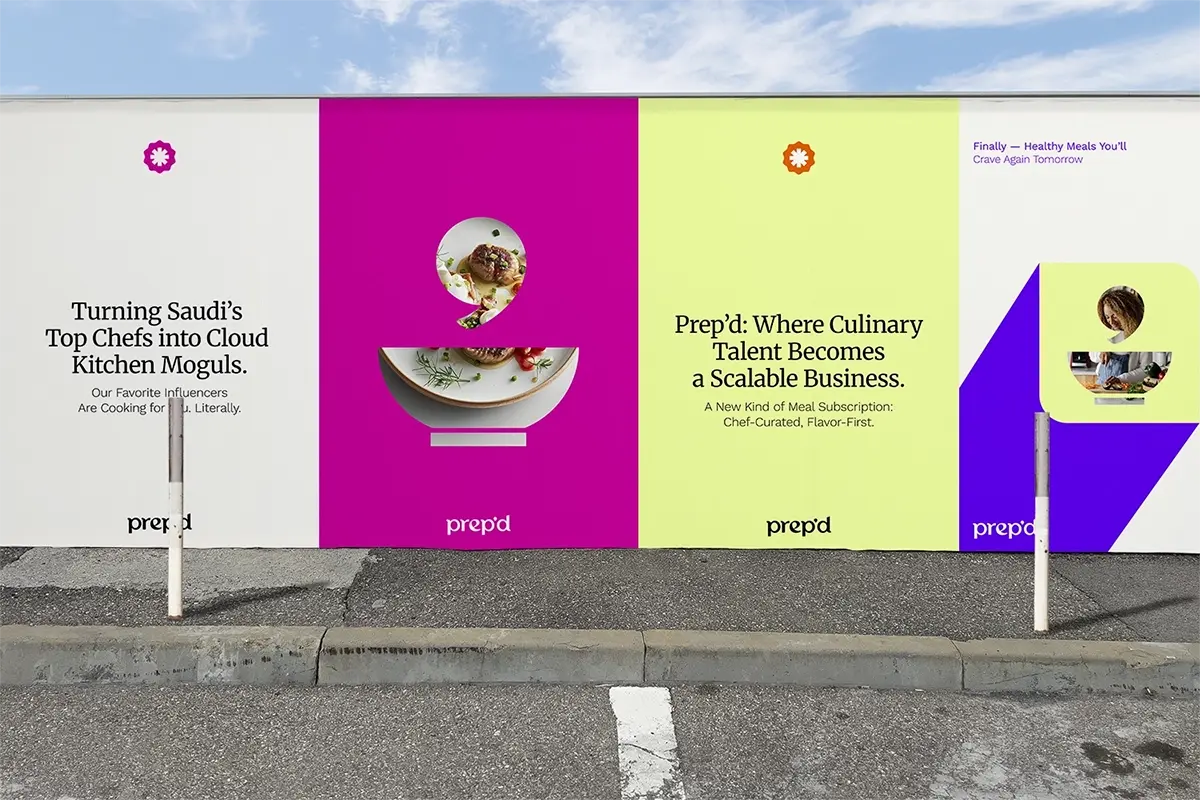
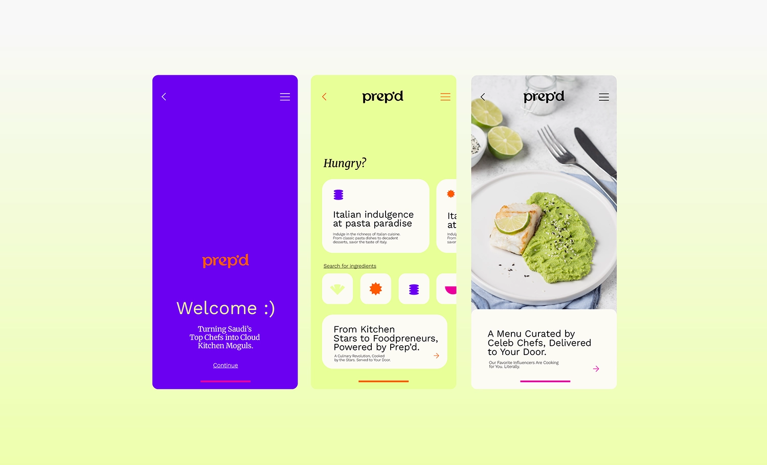
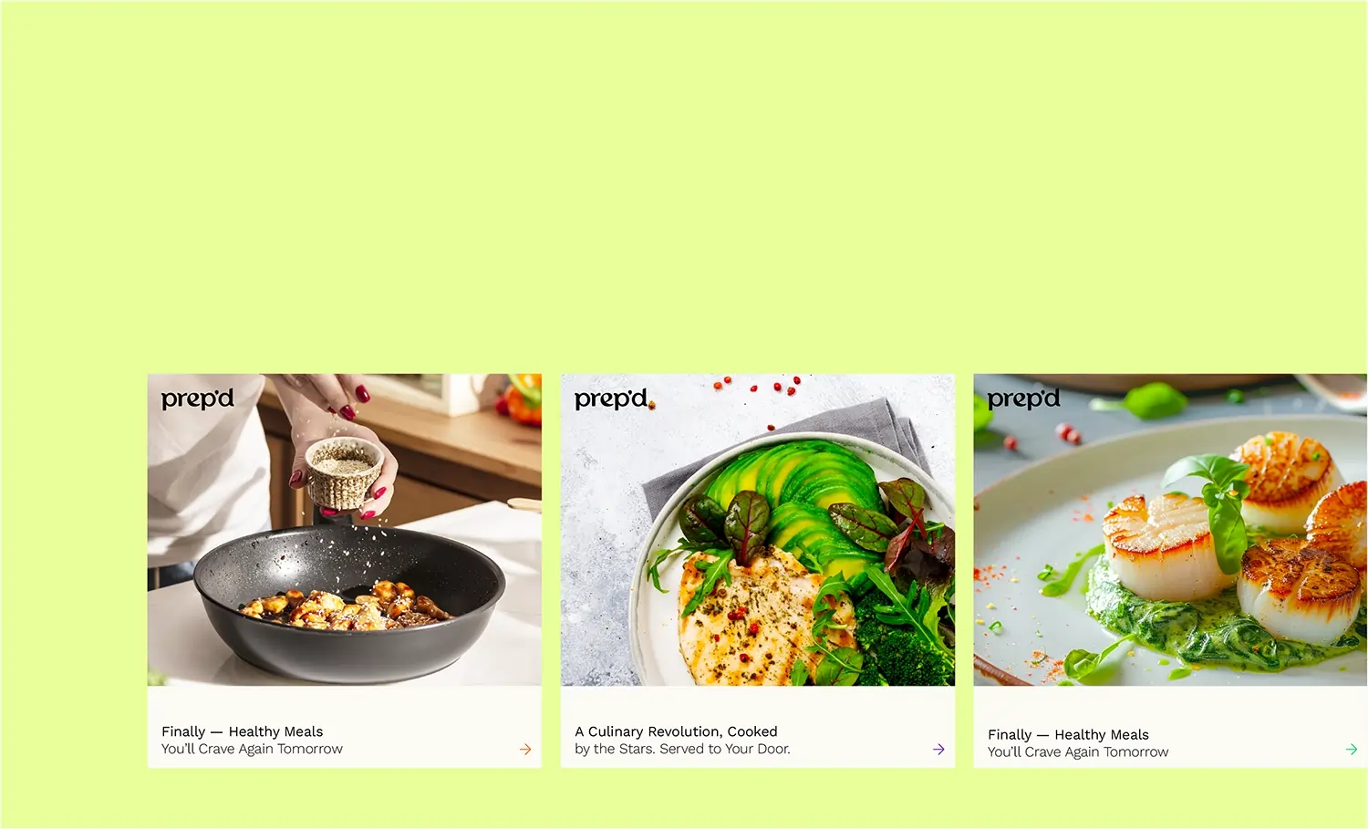
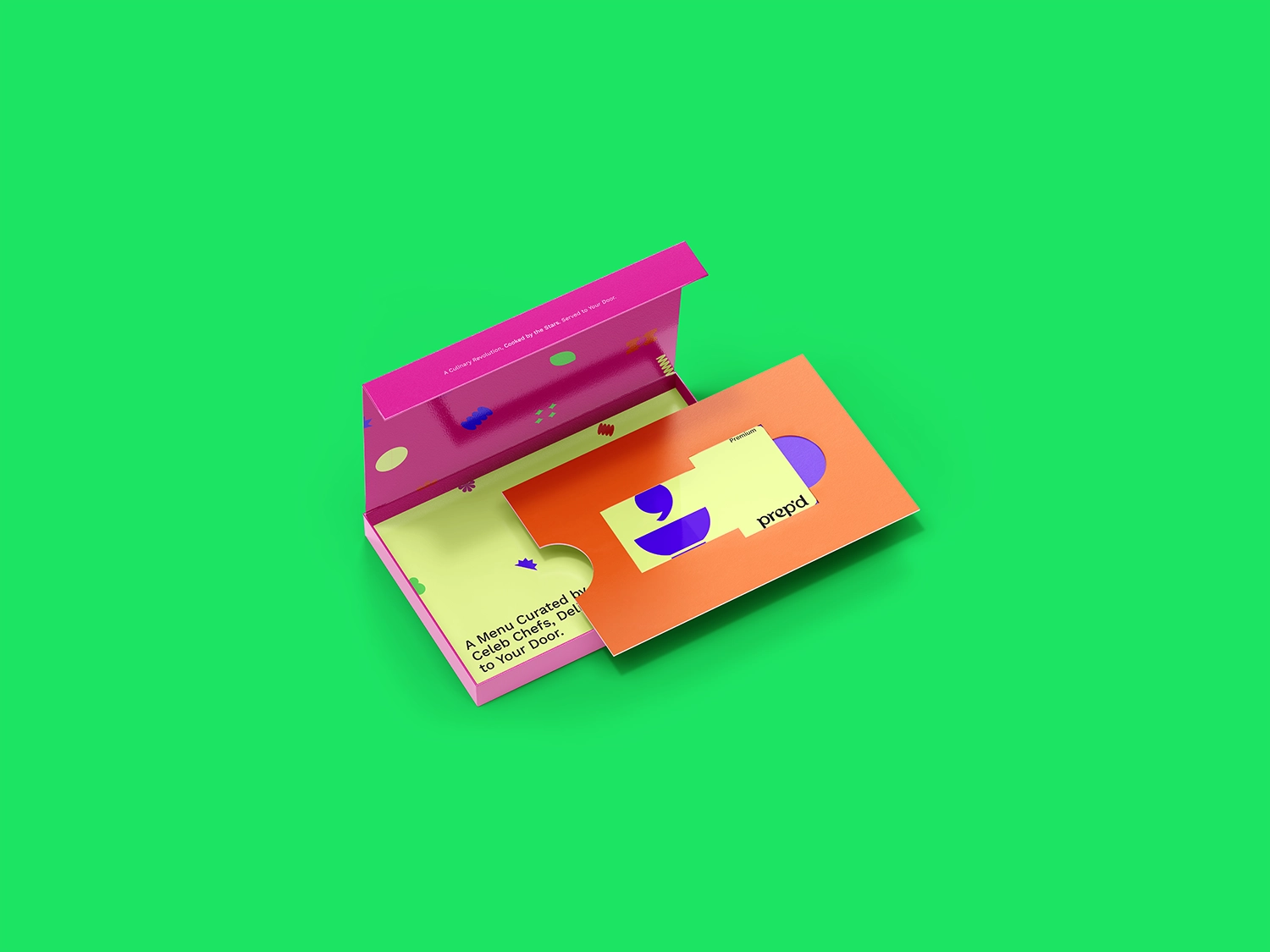


Prep'd Concept
Riyadh, Saudi Arabia
Prep’d is a culinary platform founded in Saudi Arabia with a mission to monetize culinary talent across the GCC. Launching first with a chef-driven cloud kitchen and later with Prep’d+, a subscription service focused on flavor and creativity over restrictive eating, the brand sets itself apart through vibrant storytelling and a globally inspired menu curated by top chefs and food influencers.
More than just a food provider, Prep’d delivers a personality-rich, imaginative culinary experience rooted in cultural expression.
As part of Andrea’s strategic and creative direction, establishing the Prep’d brand involved navigating a series of complex challenges. The task was to balance cheeky, unconventional branding with regional cultural sensitivity, effectively communicate the brand’s chef-led culinary value, which goes far beyond standard health-focused meal plans, and clearly articulate its hybrid business model, blending both on-demand and subscription-based offerings.
In an increasingly saturated food-tech market, Prep’d also needed to stand out visually and verbally, without sacrificing clarity or consumer trust. To overcome these hurdles, Andrea developed a brand identity that fuses bold, confident design with playful yet professional messaging and consistent, emotionally resonant storytelling.
The visual language features a vibrant color palette, whimsical graphic elements, and engaging, human-centered content, all working together to build recognition and establish trust. Meanwhile, the emphasis on curated, chef-driven menus anchors the brand in quality, authenticity, and culinary credibility. Thanks to Andrea’s strategic vision, Prep’d emerges as a confident, creative disruptor in the GCC’s evolving food landscape, bringing joyful, chef-led dining experiences to the forefront while remaining culturally attuned, operationally clear, and emotionally engaging.


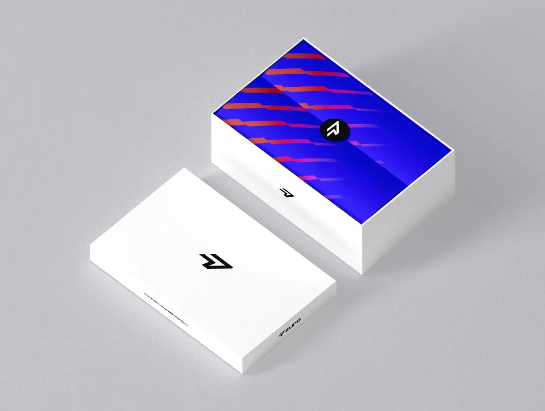

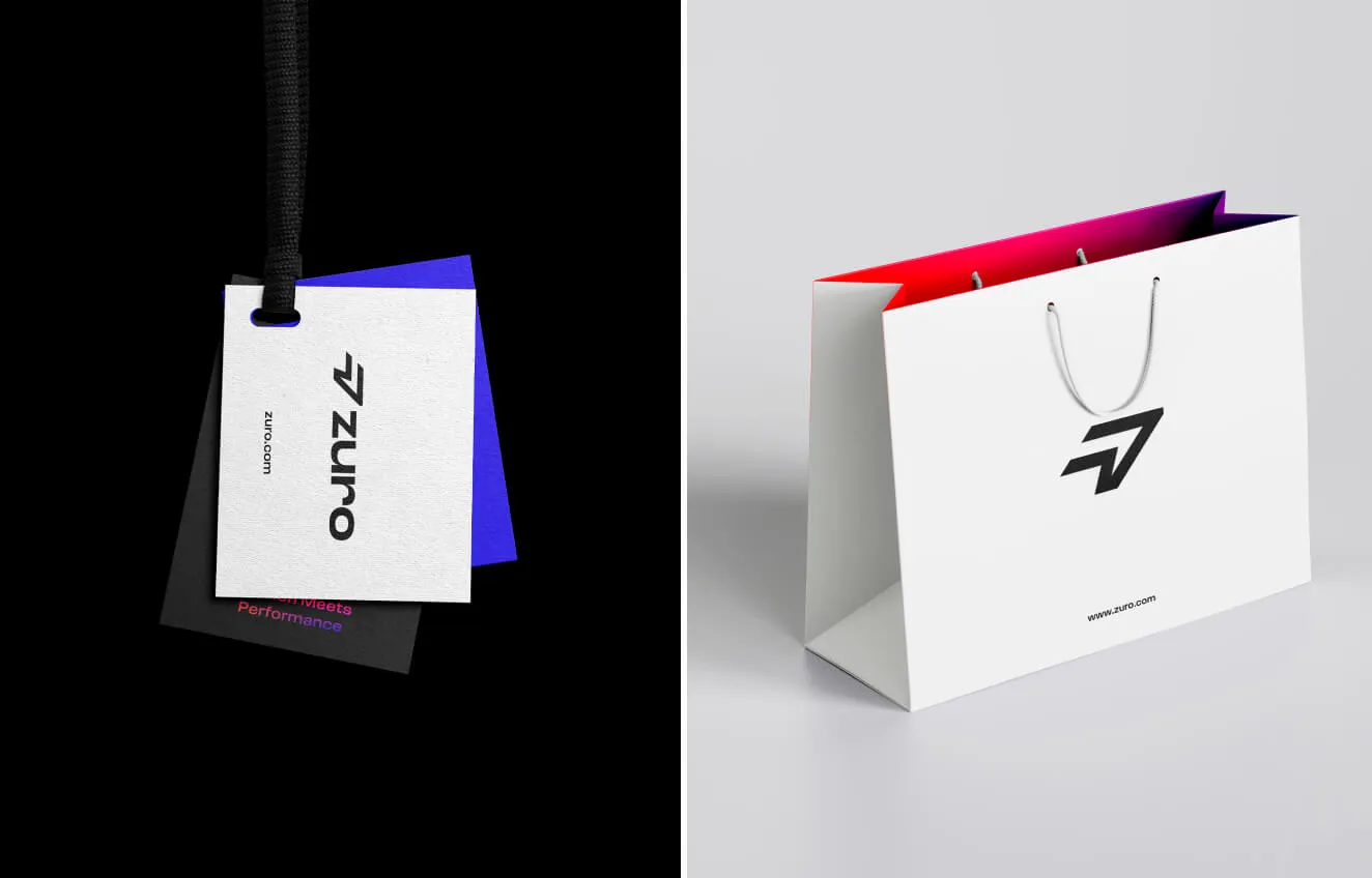
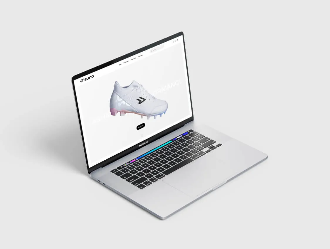


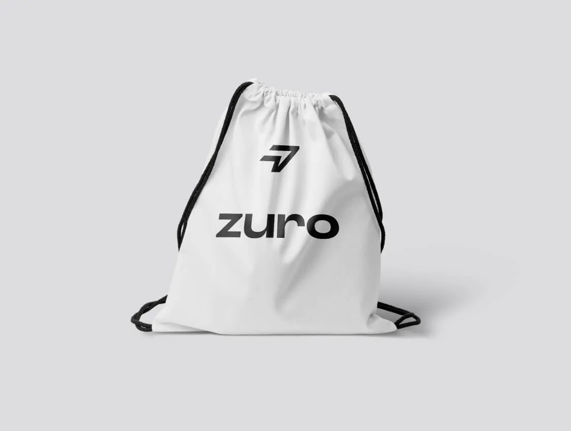
Company Name
Sydney, Australia
Zuro is a women’s sports boot brand with a mission to empower confidence and comfort for women in sports. Their vision is clear: to encourage more women to participate in athletic activities and support the development of the female athletes of tomorrow.
The challenge was to create a brand identity that spoke not to fashion elitism, but to real women, athletes, learners, and dreamers, who value authenticity, strength, and approachability in the sports space. Our primary goal was to move away from the typical, polished high-fashion narrative often seen in female athletic wear. Instead, we positioned the brand around values of inclusivity, energy, and playful strength.
This required us to craft a visual language that could communicate empowerment without being aggressive, and charm without being overly delicate. By using bold yet inviting design elements, we aimed to create a brand that resonates emotionally and visually with active, ambitious women.
Andrea brought the identity to life through a dynamic and thoughtfully crafted visual system. Animated, playful motion, colorful patterns, and a soft, welcoming gradient work together to create a brand experience that feels both energetic and approachable. These design elements not only enhance visual engagement but also reflect the brand’s personality, joyful, inclusive, and full of momentum. Andrea’s creative execution transforms the identity from a static concept into a lively, immersive experience that connects emotionally and visually with its audience.
These visual tools allowed Zuro to stand out in a traditionally male-dominated and often overly serious market. The result is a memorable, expressive brand that celebrates movement, self-expression, and the joy of sport, while reinforcing Zuro’s purpose of shaping the next generation of female athletes.